
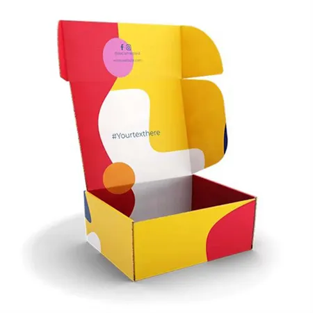
Three choices that people often mix up
A box's look comes from three separate decisions. The liner is the paper on the outside of the board, the ink goes on that liner, and the finish goes over the ink.
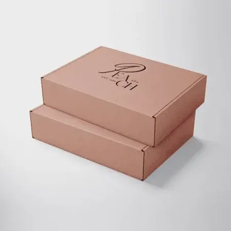
Mixing them up causes surprises. A pink logo printed on brown kraft looks warmer and darker than the same pink printed on white.
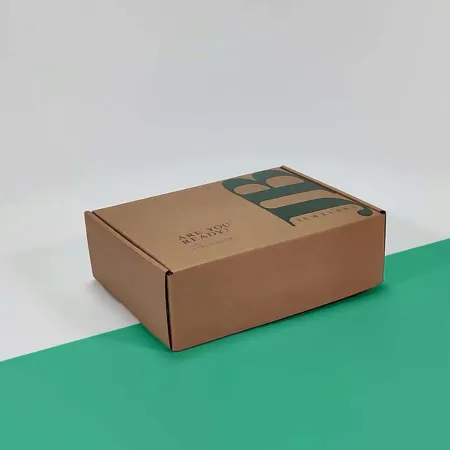
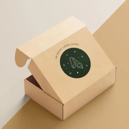
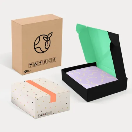
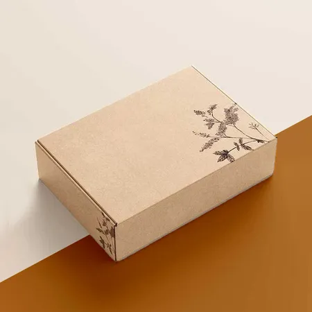
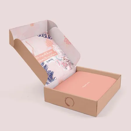
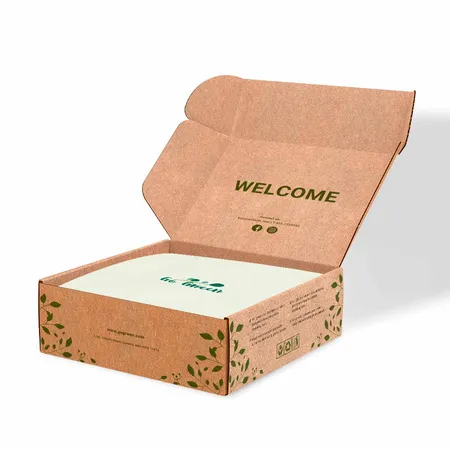
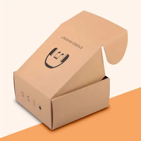
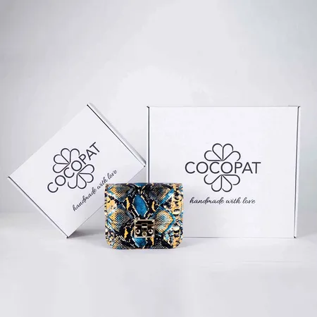
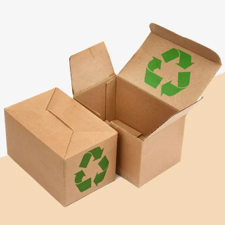
If you like the natural brown look, printed kraft mailer boxes keep the liner visible and add ink only where you need it. White ink can sit under colors so they stay bright on brown.
Settle the liner first, then the ink plan, then the finish. Each step narrows the next one.
All 27 color and finish options compared
Use the table to shortlist two or three options. Each product page then goes deeper into board, artwork setup and finish pairings.
Several rows overlap on purpose. A Christmas box can also be a glossy box on white liner, so read the rows as starting points.
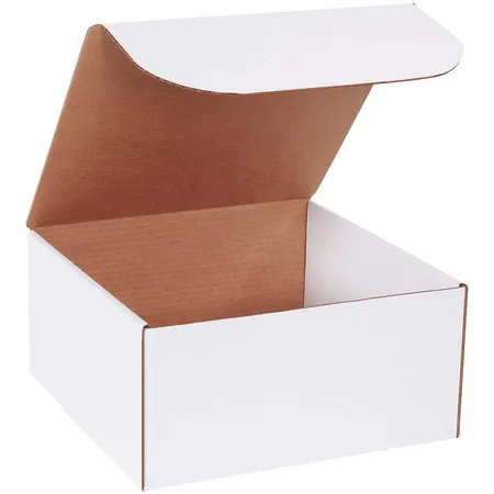
For a clean base that shows every color as designed, white mailer boxes with full color print are the safest place to start.
| Product | Best for | Key detail |
|---|---|---|
| White Mailer Boxes | True-to-file brand colors | White liner shows CMYK accurately |
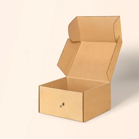
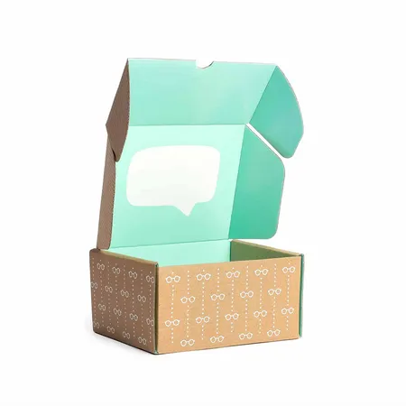
| Kraft Mailer Boxes | Natural, rustic brands | Brown liner, white ink for bright accents |
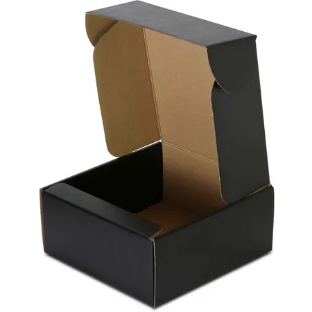
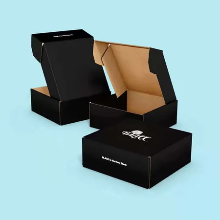
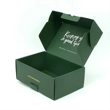
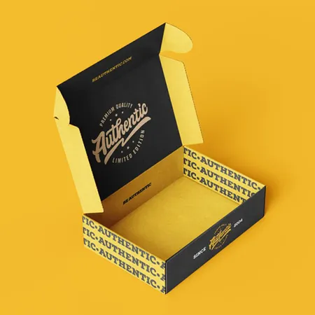
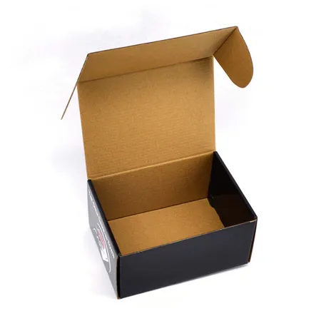
| Black Mailer Boxes | Premium fashion and tech | Rich black build, pairs with foil |
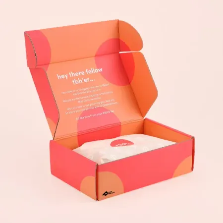
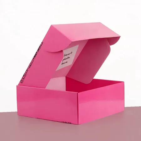
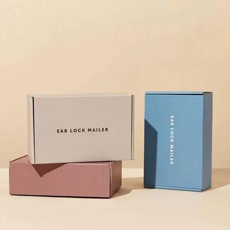
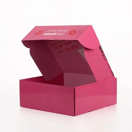
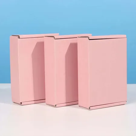
| Pink Mailer Boxes | Beauty and gift shops | Pantone match keeps pink consistent |
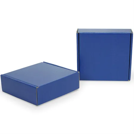
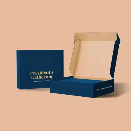
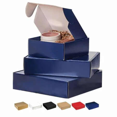
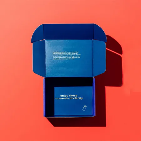
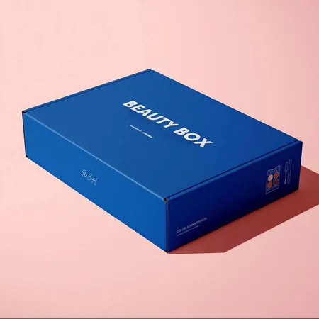
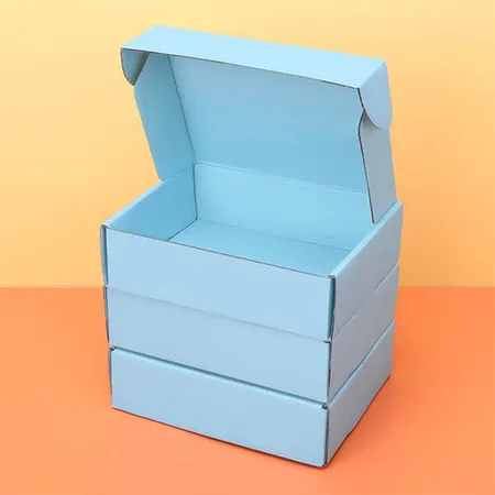
| Blue Mailer Boxes | Brands built around blue | Shade checked on proof against brand guide |
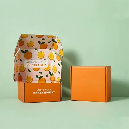
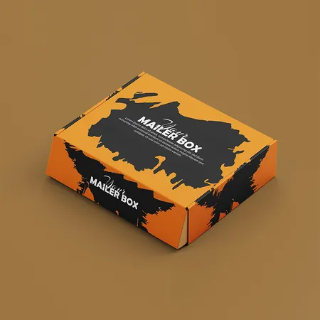
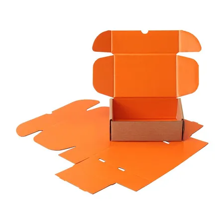
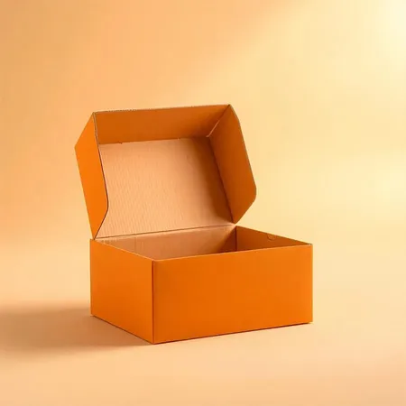
| Orange Mailer Boxes | Bold, high-energy brands | Flood color shows scuffs less on matte |
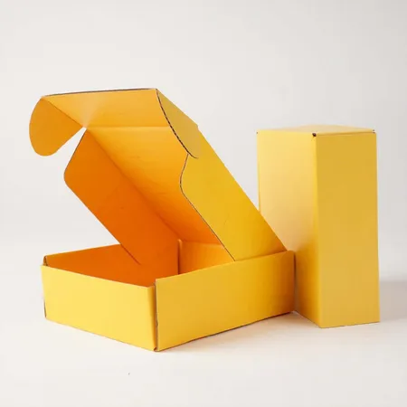
| Yellow Mailer Boxes | Cheerful kids and food brands | Needs white liner to stay clean |
| Colored Mailer Boxes | Any single brand color | Full flood in CMYK or Pantone |
| Glossy Mailer Boxes | Bright, punchy artwork | Gloss lamination deepens colors |
| Debossed Mailer Boxes | Quiet, tactile branding | Logo pressed into the lid |
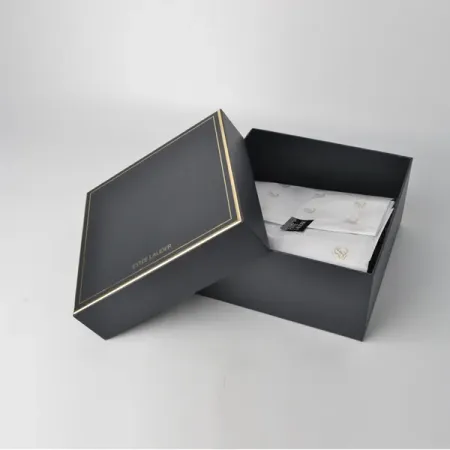
| Luxury Mailer Boxes | High-value gifts | Soft-touch, foil and inside print |
| Chipboard Mailer Boxes | Keepsake presentation | Rigid chipboard with printed wrap |
| Boxboard Mailer Boxes | Light retail items | 18–24 pt SBS or kraft paperboard |
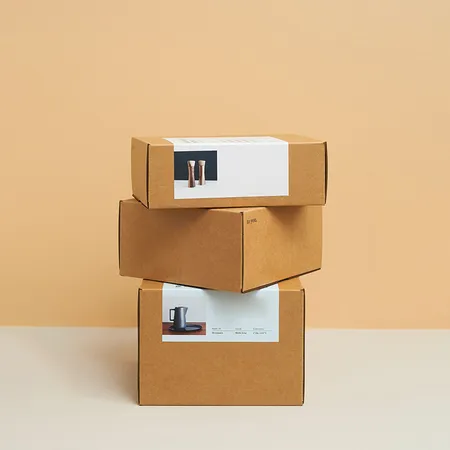
| Cardboard Mailer Boxes | Everyday ecommerce orders | Corrugated tuck front mailer |
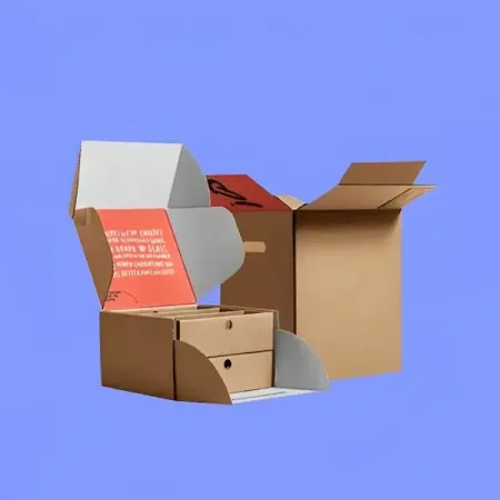
| Corrugated Mailer Boxes | Heavier or fragile goods | E-flute or B-flute board |
| Branded Mailer Boxes | Building recognition | Logo, colors and fonts on every panel |
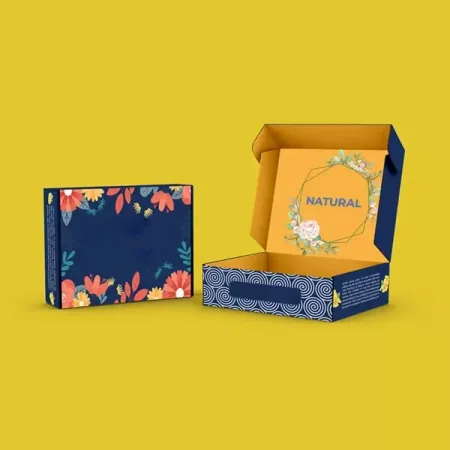
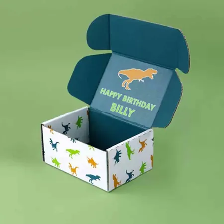
| Design Mailer Boxes | Pattern and illustration lovers | Full wraparound artwork |
| Cute Mailer Boxes | Small handmade shops | Playful art and inside surprises |
| Plain Mailer Boxes | Simple one-logo look | Light ink coverage on kraft or white |
| Blank Mailer Boxes | Stamping or labeling by hand | No print at all |
| Eco Friendly Mailer Boxes | Paper-based packaging goals | Light ink and paper inserts |
| Recyclable Mailer Boxes | Curbside-friendly packaging | All-paper build, no plastic window |
| Biodegradable Mailer Boxes | Plastic-free shipping | Uncoated paper-based board |
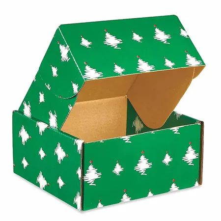
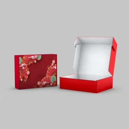
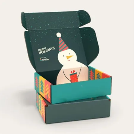
| Christmas Mailer Boxes | December gift orders | Festive art and foil accents |
| Christmas Shipping Boxes | Holiday parcel volume | Sturdier carton for transit |
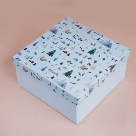
| Holiday Mailer Boxes | Seasonal runs beyond one date | Winter art that covers several holidays |
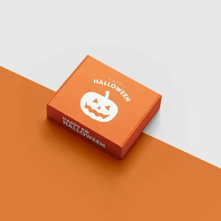
| Halloween Mailer Boxes | October launches | Dark panels with bright accents |
Picking the liner under your color
White liner gives the most accurate color. Kraft liner tints every ink toward brown, which some brands love and others fight.
A full flood of one color hides the liner completely. Colored mailer boxes in one solid shade use that approach so the box reads as your brand color from every side.
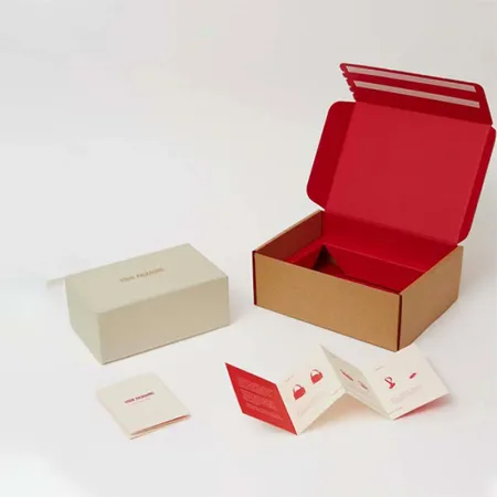
Remember the inside. On a single-printed box, the inside shows the plain liner, so a white outside with a kraft inside can feel mismatched.
Board color also shows at the cut edges. A white-liner box still has a brown corrugated core, which you see along the flaps when the lid opens.
Kraft hides edge wear well, since scuffs reveal more brown on a brown box. White shows edge rubs more, so lamination helps on white mailers that travel far.
Matching a brand color on board
Screens glow and board does not. A shade that looks vivid on your monitor will print a touch flatter on paper.
Pantone inks are mixed to a set formula, so they repeat closely from one reorder to the next. CMYK builds a color from four inks and suits photos and gradients.
Pinks and purples drift the most. Our pink mailer boxes printed to your exact shade use a Pantone reference when color matters to the brand.
Send a Pantone code if you have one. If not, send your brand guide or a printed sample and we match it on the proof.
Small type in a light color can vanish on a pale background. Keep text above 6 pt and give it strong contrast against the flood color.
Dark boxes, bright boxes and how they wear
Dark floods show scuffs and cracked folds more than light ones. A thin pale line appears where the board bends at each crease.
Black mailer boxes with a rich ink build need lamination to hold the ink together at the folds. Matte or soft-touch also hides fingerprints.
Yellow, orange and other bright colors need a white liner to stay clean. On kraft they shift toward mustard and rust.
Light colors forgive more. White and pastel boxes hide small handling marks, though they show dirt from damp sorting belts.
Blue and green sit in the middle. They hold up well in transit and print evenly on white liner with either CMYK or Pantone ink.
The finishes we offer and what each one does
A finish protects the print and changes how the box feels. Most boxes need one main finish and, at most, one accent.
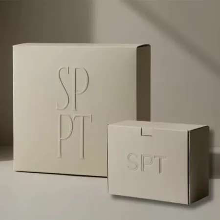
For a mark people feel before they read, debossed mailer boxes with a pressed logo push the design into the lid. Simple shapes with lines over 1 mm read best.
Finishes change color slightly. Gloss makes colors look deeper, while matte softens them a shade, so we show the finish on your proof notes.
Embossing and debossing need corrugated or thick paperboard to hold a crisp edge. Very thin board can flatten the effect over time.
- Gloss lamination: deeper colors and a shiny, wipeable surface.
- Matte lamination: soft, low-glare look that hides fingerprints.
- Soft-touch lamination: velvet feel that suits premium gifts.
- Aqueous coating: thin water-based layer for light protection.
- Spot UV: glossy areas on a matte base, such as a logo or pattern.
- Foil stamping: metallic gold, silver or colored foil on chosen details.
- Embossing and debossing: raised or pressed areas you can feel.
Premium builds for gifts and launches
High-value products need the box to match the price. Soft-touch lamination with one foil detail is the most common premium pairing.
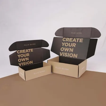
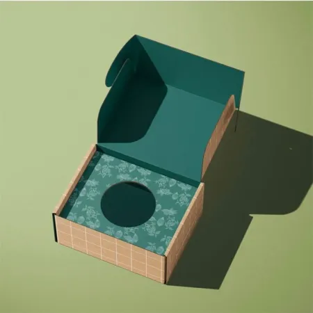
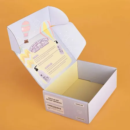
Luxury mailer boxes with soft-touch and foil often add inside print too. The lid then reveals a message or pattern as it opens.
Rigid chipboard takes a printed wrap rather than direct print. It feels heavier and stays made up, so it works best for keepsakes and launch kits.
Keep premium details to the panels people touch first. The lid top and inside lid matter more than the bottom panel, which few customers ever look at.
Paper-based and recyclable specs
Many buyers want a box that goes straight into a paper recycling bin. That means avoiding plastic windows, foam inserts and heavy plastic films.
Recyclable mailer boxes with an all-paper build use corrugated or paperboard inserts instead of foam. Aqueous coating replaces lamination when you want the lightest finish.
Keep claims on the box honest. Write that the box is recyclable where facilities accept it, and avoid wording you cannot back up.
Biodegradable and eco friendly specs follow the same idea. Paper-based board, paper inserts and lighter ink coverage keep the whole box in the paper stream.
Seasonal colors and limited editions
A seasonal box can lift a regular product into a gift without any change inside. Brands often run a winter design alongside their standard box.
Christmas mailer boxes with festive print need an early start. Count back 4–6 business days of production, 2–3 days of transit and time for proof revisions.
If you sell across several holidays, a general winter design lasts longer. Halloween boxes suit shops that launch October products.
Order seasonal and standard boxes in the same run when sizes match. You only proof the seasonal artwork, since the dieline is already approved.
When less print is the right choice
Not every brand needs full coverage. A single logo on kraft or white can look confident and keeps ink costs down.
Plain mailer boxes with a simple logo suit makers who change products often. Blank boxes go further and leave room for stamps or stickers.
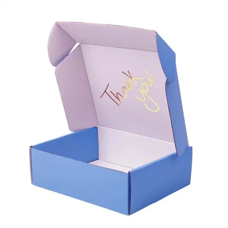
Light ink coverage also helps on the inside. A one-color thank-you line under the lid can do more than a fully printed outside.
Branded boxes sit at the other end of the scale. They carry your logo, colors and fonts on every panel, so the box works like an ad on a doorstep.
Ordering your color and finish in five steps
Work through these steps and you will have everything we need for an accurate proof.
Our guide to mailer box printing and finishes explains each finish in more depth before you decide.
Order a few spare boxes with each run. Damaged or misprinted boxes reported within 10 days are reprinted or refunded, but spares keep packing moving meanwhile.
- Choose the liner: white for true color, kraft for a natural look.
- Pick how the color prints: CMYK for photos, Pantone for exact brand shades.
- Decide on outside only, or outside and inside printing.
- Add one main finish, then at most one accent such as foil or spot UV.
- Send your artwork and color codes for a free proof with unlimited revisions.
Color and finish mistakes to avoid
These issues show up most often on first orders. We flag them on the proof, but catching them early saves a round of changes.
If you are unsure how your artwork will sit on the box, try it first in our online box preview for your logo before you send files.
- Approving colors from a phone screen instead of checking codes.
- Printing pale colors straight onto kraft without white ink underneath.
- Stacking foil, spot UV and embossing on one small logo.
- Running dark ink over folds without lamination.
- Placing thin foil lines under 0.5 mm, which can fill in.