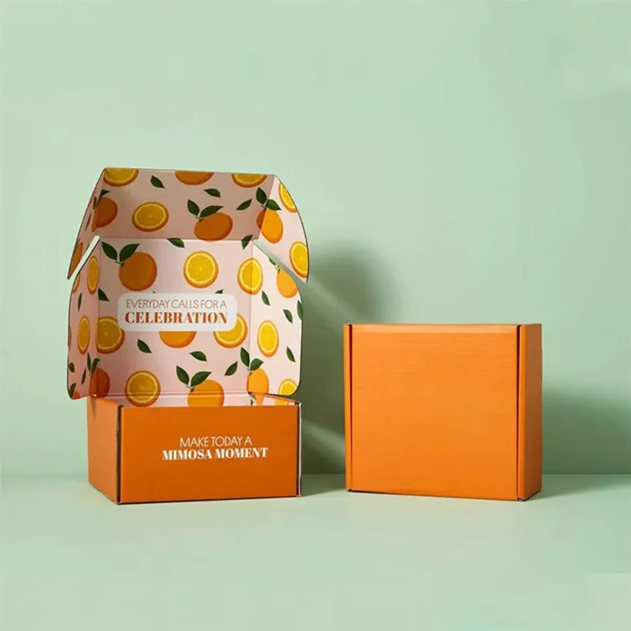
Who orders artwork-led mailers
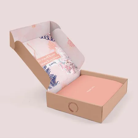
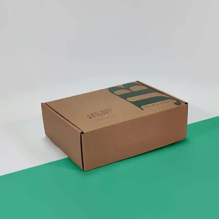
These boxes suit brands where the art is part of the product. Illustrators, print studios, children's brands, bakeries and seasonal gift shops order them most.
Some customers bring a signature pattern they already use on tissue, labels and social posts. Others want a one-off scene for a launch, a collaboration or a holiday drop.
If your brand is mostly a logo on a plain color, a simpler printed mailer will do the job. This page is for when the whole surface is the canvas.
Playful brands with characters or mascots fit here too. For softer pastel looks and rounded type, see our cute mailer boxes for gift brands.
Patterns, scenes and wraparound art
Artwork on a mailer usually falls into one of a few approaches. The right one depends on what you want customers to notice first.
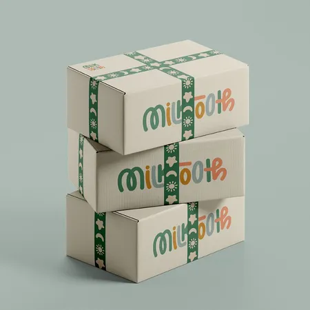
A repeat pattern is the most forgiving. It hides small shifts at the folds and looks good from every angle in a stack.
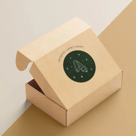
A single illustrated scene is more striking but needs careful planning. The main subject has to sit on the lid, clear of folds and flaps.
Pattern scale matters more than people expect. A motif that looks great on a large shipper can turn into visual noise on a small jewelry mailer.
| Art approach | Where it shines | Risk to plan for |
|---|---|---|
| Repeat pattern | Every panel, stacks well | Pattern scale on small boxes |
| Lid illustration | Strong first impression | Subject crossing a fold |
| Wraparound scene | Story across all sides | Panels lining up at corners |
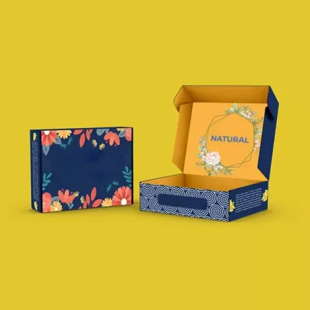
| Pattern outside, message inside | A two-stage reveal | Contrast between the two |
| Photo collage | Product-led brands | Low resolution source images |
How folds and flaps affect your design
A mailer starts as one flat printed sheet that is cut and folded. Every fold line is a place where artwork can split or look slightly off.
Pattern repeats should run continuously across the dieline, not panel by panel. That way the pattern meets itself cleanly when the box closes.
Faces, lettering and logos need a safe margin from every crease. We mark those safe zones on the dieline we send you.
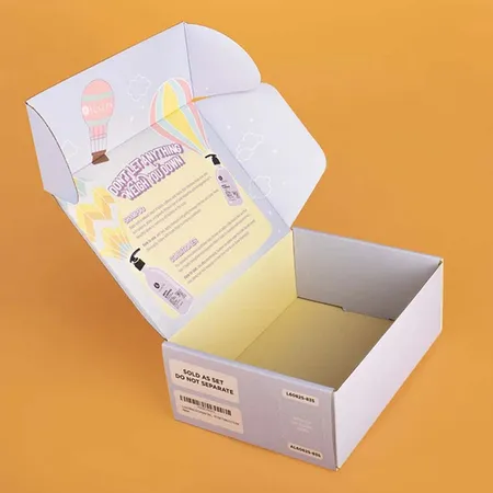
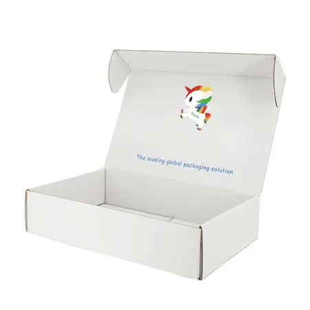
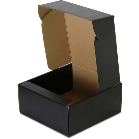
The tuck flap and dust flaps are visible when the box opens. Treat them as part of the design rather than leftover space.
Preparing files for full coverage
Full coverage art needs more care than a simple logo layout. Our step by step mailer artwork guide covers bleed, safe zones and color settings.
If you are an illustrator, work at full size on our dieline from the start. Scaling art up later softens line work and texture.
- Ask us for the dieline in your box size.
- Place artwork on the dieline with bleed past every cut edge.
- Keep text and faces inside the marked safe zones.
- Set the file to CMYK and note any Pantone colors.
- Export as a print PDF or send the layered source file.
Working with our designers
You do not need finished files to start. Many customers send a sketch, a mood board or a few reference images.
Our team builds the layout on the dieline and handles the technical setup. You can start your box design with our team and share whatever you have.
Design help and proof revisions are free. Revisions are unlimited, so you can try a pattern at two scales or swap colors before deciding.
If you work with your own illustrator, we can send them the dieline directly. They design on it, and we check the file before it goes to print.
Getting colors right on board
Bright art looks different on board than on a backlit screen. Saturated blues, greens and neon tones often print a little calmer.
Brand colors that must match exactly go on as Pantone spot inks. That keeps it consistent from one run to the next.
A white liner gives the brightest result. Kraft board warms every color and suits earthy palettes, and white ink under the art helps lighter colors show on kraft.
If you want to see a color before committing, ask about it during the proof stage. We can note which shades will shift and suggest close alternatives.
Using the inside of the box
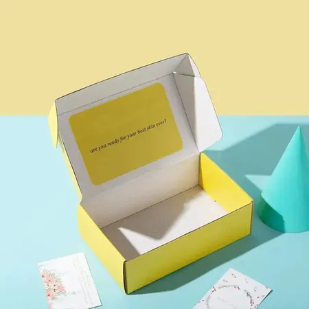
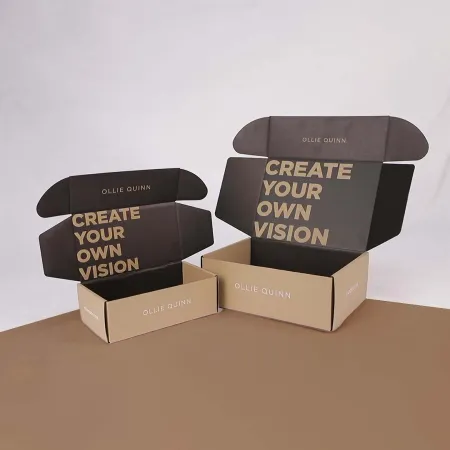
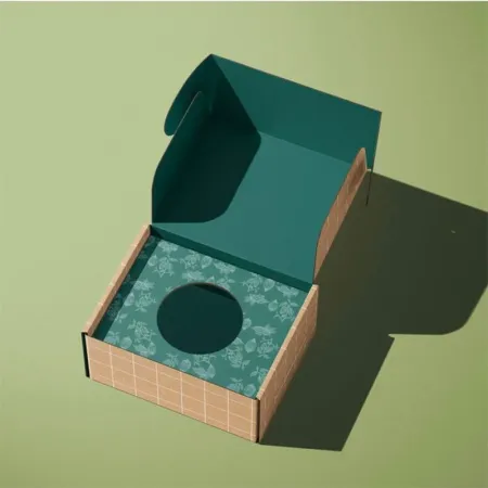
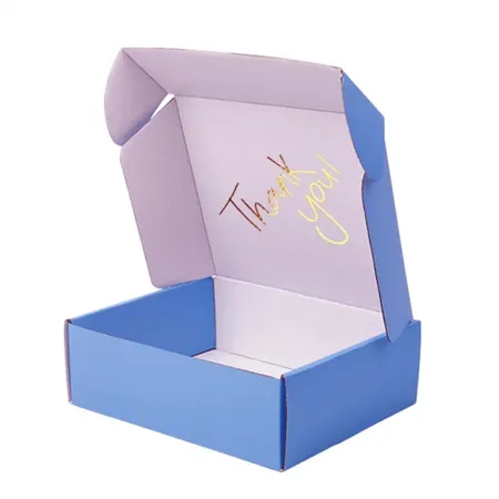
The inside is where design mailers often surprise people. A pattern outside with a solid color and a short note inside creates a second moment after the lid lifts.
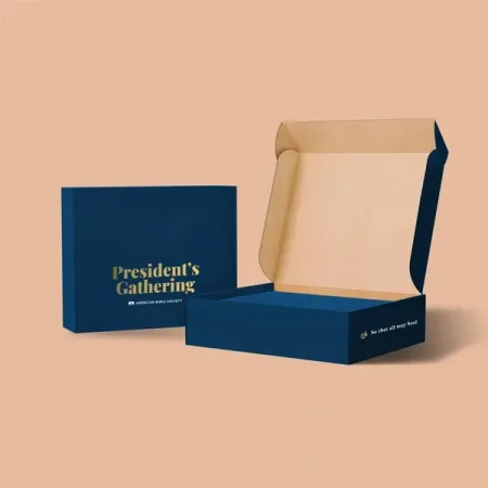
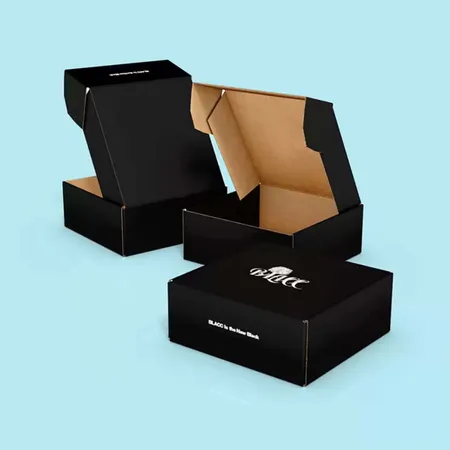
Some brands reverse it, with a plain outer and the full artwork hidden inside. That suits products shipped to offices or shared mailrooms.
Printing both faces is covered in detail on our double sided mailer boxes page. The art files are prepared as two separate sheets.
Inside art is printed on the reverse of the board. Keep it simple near the edges, where the box walls fold up and meet.
Finishes that protect detailed art
Lamination sits over the print and guards it against scuffs in transit. Matte suits illustration and textured art, while gloss makes photos and bold colors look richer.
Soft-touch gives a velvety feel that pairs well with muted, painterly work. It can soften very bright colors slightly, which some artists like.
One accent is usually enough on a busy design. A foil logo on a patterned lid can get lost, so keep accents for calm areas of the art.
Photos of each finish on real boxes are in our guide to mailer printing and finishes. It helps to compare matte and gloss on similar art.
Common artwork mistakes we fix
Most problems are easy to spot on a proof. These are the ones that come up most with full custom art.
We flag each issue on your proof with a note. You decide whether to adjust the art or keep it as it is.
Fonts are another quiet problem. Outline your type or send the font files so the lettering prints exactly as drawn.
- Low resolution images taken from a website
- A pattern that stops short of the bleed edge
- Text running across the lid hinge
- RGB files with neon colors that cannot print as shown
- A scene designed for a square box placed on a long one
Picking the board under the art
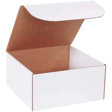
E-flute corrugated is the usual choice for mailers that travel by post. It protects the product and still prints cleanly edge to edge.
SBS paperboard gives the sharpest image for small, light items like stationery, cards or accessories. Our comparison of corrugated and paperboard mailers explains which suits your product weight.
Either board folds flat, so your boxes arrive in compact cartons. That makes storage easy for small studios and home businesses.
Heavier products or longer trips may call for B-flute. The thicker wall still prints full color, though very fine line work looks slightly softer than on E-flute.
Quote, proof and delivery
Send your size, quantity and either artwork or a description of the look you want. Prices begin at $0.30 per unit, with size, material, quantity and finish setting the exact quote.
You get a free digital proof with your art placed on the real dieline. If anything is unclear, ask our artwork team a question before you approve.
Printing takes 4–6 business days once the art is approved. Delivery takes 2–3 business days and costs nothing to the US, UK, Canada or Australia.