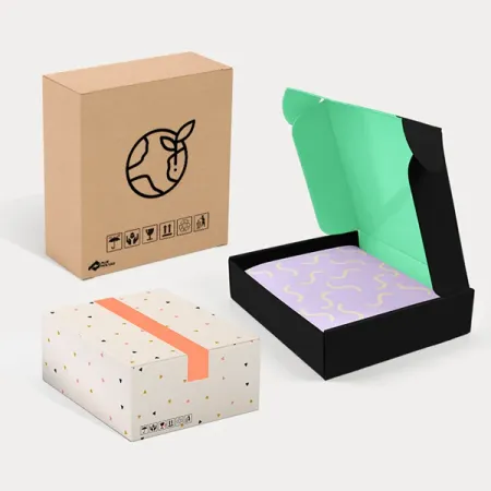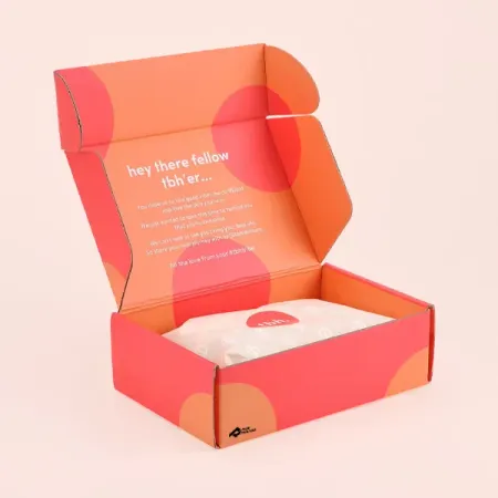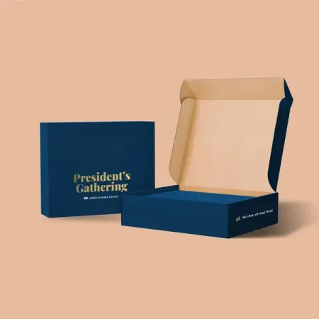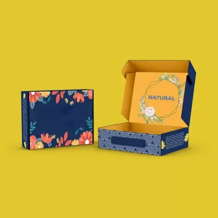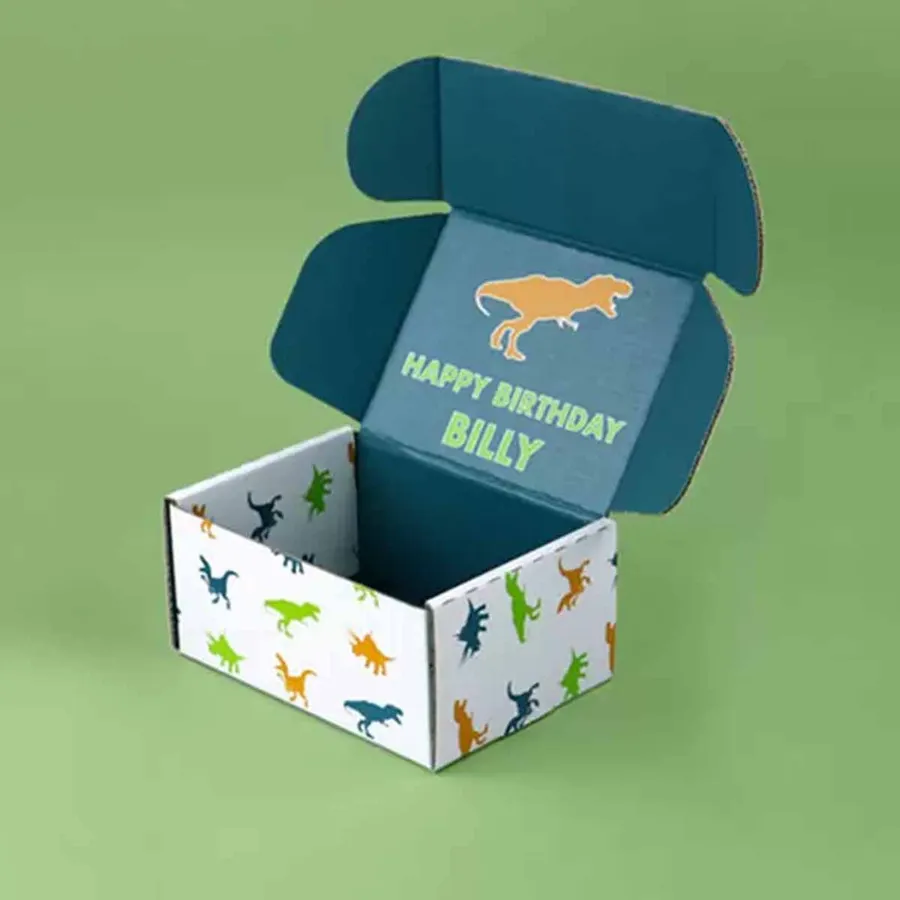
Brands that build their box around a color
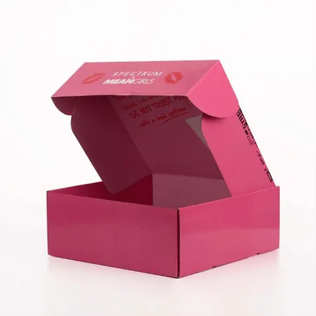
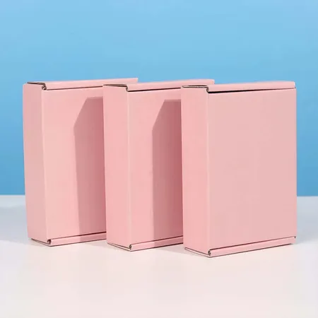
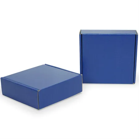
Some brands are known by one color before anyone reads the logo. A colored mailer turns that color into the first thing a customer sees on the doorstep.
Fashion labels, beauty brands, gift shops and candle makers order these most. Many of them sell online only, so the box is the one physical touchpoint they control.
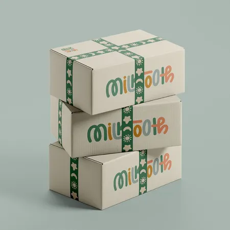
Product ranges use them too. A brand with three scents can give each one its own shade. The box shape and logo stay the same.
Event and launch teams order short runs as well. A new product drop in a bold shade gets noticed when it lands with press contacts or early buyers.
How a solid color box is printed
Board does not come in every color. The shade you see is ink printed across the full sheet before it is cut and creased.
That full coverage is called a flood. It runs past the cut lines into the bleed. That way no white or brown edge shows once the box is folded.
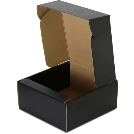
The base liner under the ink changes the result. White liner gives clean, true color, while kraft liner pulls every shade darker and warmer.
Because the color is ink, any shade is possible. You are not limited to a short chart of stock board colors, and the box can match your other packaging.
Pantone flood or CMYK build
There are two ways to print a solid color. The choice affects accuracy, consistency and how the color holds up on a reorder.
A Pantone spot ink is mixed to one exact recipe. A CMYK build layers four process inks to approach the shade. It works well when the box also carries photos or gradients.
Our printing method and finish guide goes deeper on both.
One practical point matters here. If you will reorder often over several years, a spot ink is easier to hold steady than a four-color build.
| Your situation | Method we usually suggest | Why |
|---|---|---|
| One signature brand color | Pantone spot flood | Most exact match |
| Color plus product photos | CMYK build | One process covers everything |
| Bright orange, teal or purple | Pantone spot flood | CMYK cannot reach some shades |
| Soft pastel shade | Pantone on white liner | Kraft muddies light tones |
| Deep navy or forest green | Either, on white liner | Both hold dark shades well |
Choosing the shade for your box
Start from your brand guide, not a phone screen. Screens glow, board does not, so most colors print a little calmer than they look online.
Send us a Pantone code if you have one. If you only have a HEX value, we suggest the closest Pantone match and show it on the proof.
Consider where the box ends up once it is unpacked. A shade that works on a shelf or vanity has a longer life than one people throw out at once.
Color also sends a message about price and category. Deep shades tend to read as premium, while bright ones feel playful and lively.
- Pick one main shade and at most one accent color
- Check your logo color against the flood for contrast
- Darker floods show scuffs, so add a protective coating
- Light floods show dirt from handling, so matte helps
- Ask for a physical color reference if exactness matters
Color inside, outside or both
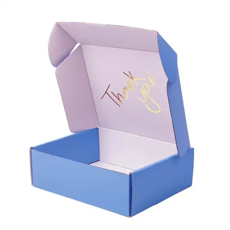
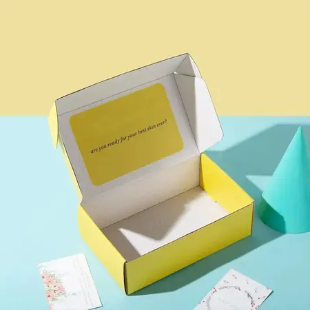
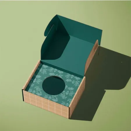
Outside color gets the box noticed. Inside color is what the customer sees when the lid lifts, and it can carry a different mood.
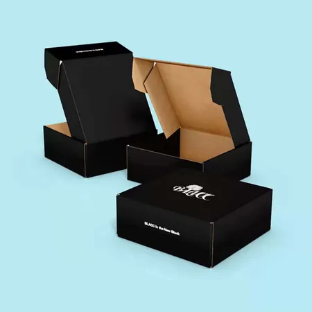
A popular approach is a calm outside shade with a bold contrast color inside. Another is a plain kraft exterior with a bright inside flood that appears only on opening.
Printing both sides costs more than one side, so we quote each option. Our two-sided printed mailer boxes show how inside and outside print work together.
Inside color also hides small marks from packing. A light inside flood can look tired once hands have touched it, so mid tones often work better.
How finishes change the look of your color
Every finish shifts color slightly. Plan the finish at the same time as the shade, not afterward.
Gloss lamination makes colors look deeper and richer. Matte lamination softens them and cuts glare, which suits muted and earthy shades.
Soft-touch gives a velvety feel and darkens most colors a little. Aqueous coating changes the shade least and adds basic scuff resistance.
We show the chosen finish on the proof notes so you know what to expect. If you are torn between two, tell us how the box is used and we will suggest one.
A color set for a product range
Brands with several lines often want a family of boxes. Same size, same logo position, a different flood for each line.
Colors in a set should sit well together on one shelf or in one photo. We check that the shades differ enough to tell apart and stay balanced in strength.
Is one box in the range white? The tips on our white mailer box page stop it looking unfinished beside the others.
Order quantities can differ by color. A best-selling line may need far more boxes than a seasonal one. We quote each color as its own line.
Ordering a colored mailer, step by step
Most color orders follow the same path. If you are building artwork yourself, our dieline artwork setup guide explains bleed for full floods.
Physical samples are worth sending for a strict brand color. A fabric swatch, a printed card or an existing product gives us a real target.
- Tell us the box size, board, quantity and your target shade.
- Share a Pantone code, HEX value or a physical color sample.
- We confirm the print method and send a quote.
- You get a free digital proof showing the flood, logo and finish.
- Request edits as many times as needed until the color plan is right.
- Production takes 4 to 6 business days after approval, then 2 to 3 business days in free transit.
Color problems we fix at the proof stage
These issues are common on color-led boxes. Spotting them early keeps the finished run looking even.
Each one is caught on the proof, but noting them early saves a revision round.
- Logo in a shade too close to the flood, so it disappears
- Bleed missing, leaving a thin white line at fold edges
- Pastel flood on kraft, which turns gray and flat
- Fine reversed text in a CMYK build that blurs at small sizes
- Two range colors so similar that customers mix them up
Keeping the same shade on every reorder
Color drift is the biggest worry on a repeat order. A box that is a little off next to last month's stock is easy to notice.
Board batches and humidity can nudge a flood slightly lighter or darker. Starting from the same recorded settings keeps that movement small.
We keep your Pantone reference, board and finish on record. Reorders use those same settings, which is why spot inks are the safer choice for a signature shade. For general questions about runs and records, our packaging FAQ page covers the basics.
What a colored box costs and how to start
Colored mailers start at $0.30 per box. Flood coverage, number of sides printed, finish and quantity shape the final quote.
Adding foil, spot UV or a second side raises the unit cost. A plain flood with a crisp logo often looks just as strong.
A one-sided flood with aqueous coating is the most budget-friendly color option. Want to compare a few shades or finishes? Ask us to quote your colored mailers and list each option you are weighing.