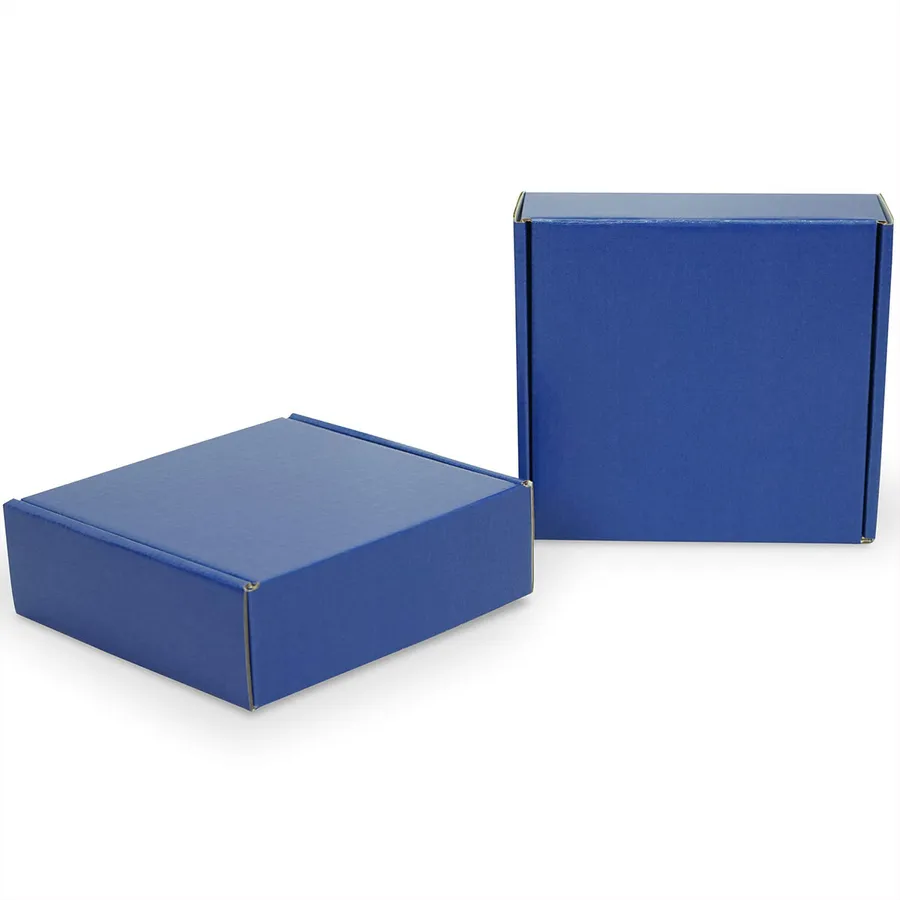
Brands that build around blue
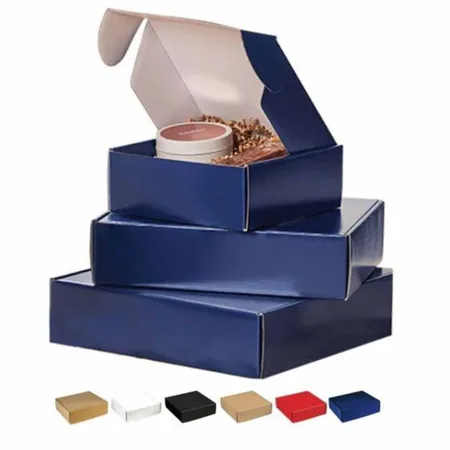
Blue shows up across many trades, and each one tends to favor a different shade. Swimwear and travel brands lean toward bright aqua and sky tones.
Tech accessory shops, cleaning brands and baby product sellers often use a clean royal or mid blue. Menswear, finance welcome kits and premium tea brands favor deep navy.
Because the shade carries so much of the brand, getting it right on the box matters more than with neutral colors. A box that is slightly off looks wrong next to your website and labels.
We often see brands order a test run in one shade before committing. That is a sensible way to check the color in real light.
Why your blue looks different on screen
Screens make color with light, while printers make color with ink on board. Bright electric blues on a monitor sit outside what CMYK ink can reach.
That is why a file that looks vivid on your laptop can print slightly duller. The fix is to plan for ink from the start, not to push the file brighter.
A Pantone spot blue is mixed as a single ink. It reaches cleaner, brighter blues than a CMYK build and stays more consistent from run to run.
If you already have a Pantone number in your brand guide, send it with your artwork. That gives us a fixed target to match.
Picking a shade for your box
Each family of blue behaves a little differently on board. The table shows what to expect and how we usually print each one.
If your shade sits between two families, tell us which feel matters more. A blue that reads calm and a blue that reads bold need different mixes.
| Shade | Common use | Printing tip |
|---|---|---|
| Navy | Menswear, premium gifts, finance kits | Pairs well with gold foil and matte lamination |
| Royal blue | Tech, cleaning products, sports | Pantone gives the cleanest result |
| Sky or baby blue | Baby goods, bakery, gift boxes | Print on white liner to keep it light |
| Teal or aqua | Swimwear, wellness, travel | Check proof closely, as it can drift green |
| Dusty blue | Weddings, stationery, candles | Matte lamination keeps the soft look |
Blue on white liner versus kraft
White liner gives the truest blue. The ink sits on a bright base, so light shades stay light and bright shades stay clean.
Kraft liner is brown, and blue ink printed straight onto it turns darker and slightly green. Navy holds up well on kraft, but sky blue does not.
For a lighter blue on kraft, we print a white ink base first and lay the blue over it. Our printed kraft mailer box range shows how white ink changes the result.
If you love the kraft look but need an accurate shade, ask for both versions on your proof. You can compare them before choosing.
Steps to get your exact blue
Color matching takes a little planning. Following these steps keeps the proof stage short and avoids surprises.
- Find your brand blue as a Pantone number, or send a printed sample you like.
- Choose white liner unless kraft is part of your brand look.
- Decide on matte, gloss or soft-touch, since each shifts the shade slightly.
- Send vector artwork with the blue set as a spot color.
- Review the free digital proof on a calibrated screen if you can.
- Ask for changes until the shade and layout look right, then approve.
How lamination changes the shade
Gloss lamination makes blue look deeper and more saturated. It suits bright royal and aqua shades that you want to pop.
Matte lamination softens blue slightly and cuts glare. Navy and dusty blue look especially good under matte.
Soft-touch adds a velvet feel and mutes the color a little more. See our glossy laminated mailer boxes if you want the most vivid finish.
Whatever you pick, decide before the proof stage. Changing the finish after approval can mean a fresh color check.
Accent colors that work with blue
Blue pairs easily with a second color or a metallic. Choosing one accent keeps the design clear and readable.
Avoid placing two blues of similar strength side by side. They tend to fight each other, and neither one looks like your brand color.
- Navy with gold foil for a classic premium look.
- Royal blue with white type for strong contrast and easy reading.
- Sky blue with soft yellow or coral for baby and gift brands.
- Teal with silver foil for a cool, modern finish.
- Any blue outside with a white or pale inside for a bright reveal.
Keeping blue consistent on reorders
Shade drift is the most common complaint with colored boxes. A box from your second order that looks lighter than the first is very noticeable on a shelf.
Pantone spot colors give the most repeatable result. We keep your color references and dieline on file for every reorder.
Keep one box from each order as a reference. If a later run ever looks different, you have a physical sample to compare against.
Our guide to box printing methods and finishes explains the difference between spot and CMYK color in more depth.
Where blue mailers get used
Most blue mailers carry direct-to-customer orders. The color helps parcels stand out on a doorstep beside brown and white boxes.
Some brands use blue for one product line or a seasonal edition. A summer swimwear drop in aqua boxes is easy to spot in social posts.
Blue also works well for corporate gifting. Many company logos are blue, so a matching box looks planned rather than generic.
If you want to see blue next to other colors, browse our custom colored mailer box options before you settle on a shade.
Designing the inside of a blue box
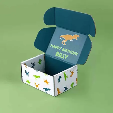
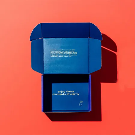
A solid blue interior feels bold and works well with white tissue. A white interior with a small blue pattern feels lighter and fresher.
Inside printing is also a good spot for a thank-you line or social handle. Keep it short and place it where the lid opens.
Dark blue interiors can make small items hard to see. If you ship jewelry or tiny accessories, a lighter interior helps them stand out.
Our unboxing experience planning guide covers tissue, cards and layout ideas that pair well with colored boxes.
Proofs, production and shipping
Every blue box order includes a free digital proof and unlimited revisions. Your blue run goes on press after color sign-off and finishes in 4–6 business days.
Boxes then spend 2–3 business days in transit, free to the US, UK, Canada and Australia. If your boxes arrive misprinted, our reprint and refund terms cover reports made within 10 days.
Want to try a layout first? Our design team can mock up two shades side by side so you can choose with confidence.