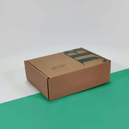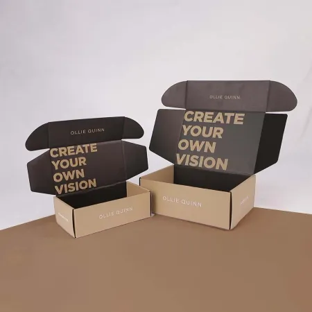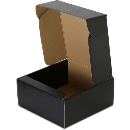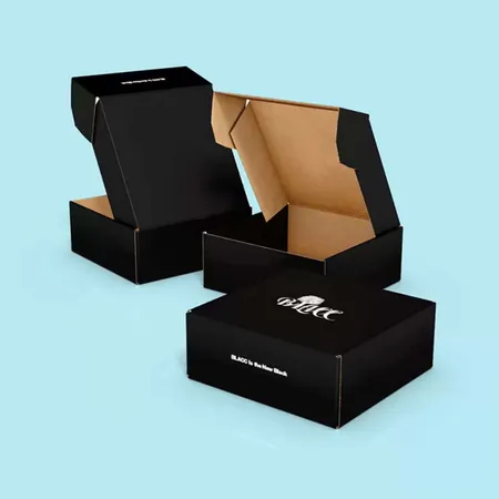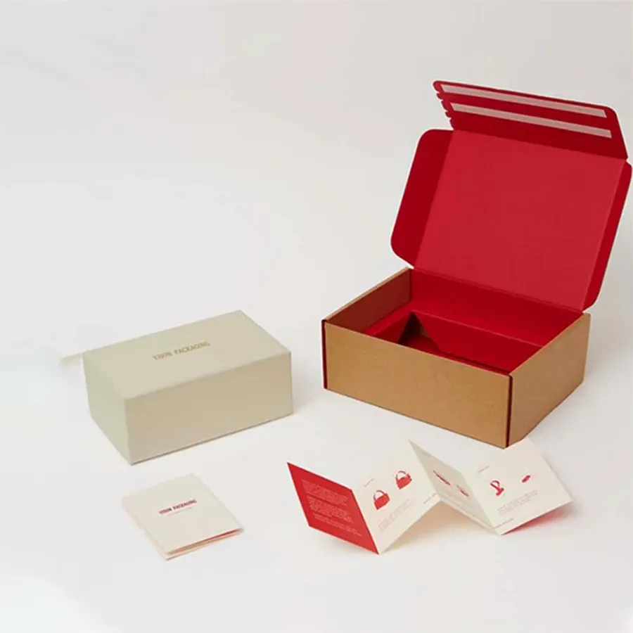
Makers and small brands who pick kraft
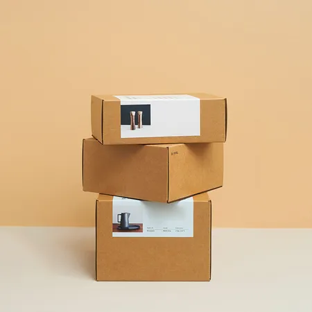
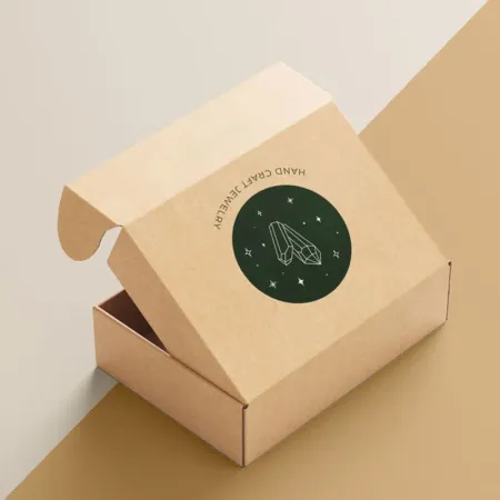
Handmade soap, candle and ceramics sellers are the classic kraft buyers. The brown board matches the craft behind their products.
Small apparel labels, stationery shops and plant sellers choose it for the same reason. It reads as practical and unfussy, which suits their audience.
Kraft also suits brands that want packaging to step back. The product is the star, and the box is a tidy, warm frame.
Coffee roasters, tea blenders and bakers like it for food gifts. It sits well beside paper bags, twine and hand-stamped labels.
Market sellers moving online often start here. Kraft looks right next to a stall table, so the brand feels the same in both places.
How color behaves on brown board
Ink on kraft is slightly see-through. The brown shows through and shifts every color warmer and darker.
Black prints crisp and true. Dark greens, navy and deep red look rich. Pale pinks, yellows and light blues fade into the brown and lose punch.
White ink changes that. Printed first as an underlay, it gives light colors a base so they look close to how they would on white board.
Kraft also varies a little from batch to batch. Expect slight shifts in the brown shade between reorders, and design with that range in mind.
If your brand color is pale, decide early whether to use white underlay or switch to a darker shade for the box. Both are valid routes.
| Ink choice | Result on kraft | Good for |
|---|---|---|
| Black only | Sharp and high contrast | Logos, line art, stamps |
| Single Pantone dark tone | Rich and warm | Simple brand marks |
| White ink alone | Soft, chalky contrast | Minimal, modern looks |
| CMYK with no underlay | Muted and darker | Vintage, earthy art |
| CMYK over white underlay | Brighter, closer to true | Photos and pastel brands |
Choosing between kraft corrugated and kraft paperboard
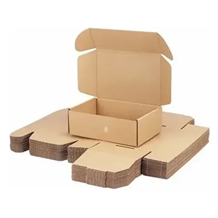
Kraft E-flute corrugated is the common choice for shipped orders. It protects jars, mugs and bottles and folds into a firm tuck-front box.
Kraft paperboard at 18 to 24 pt suits light, flat goods like scarves, prints and small soaps. It is thinner and takes fine detail well.
Heavy items can move up to B-flute kraft corrugated. Our article on corrugated versus paperboard mailers explains where each one fits.
Think about how the box gets handled after opening. Customers often keep sturdy kraft corrugated boxes for storage, which keeps your logo in their home.
Designing artwork for kraft
Design with the brown as a color in your palette. Leaving large areas unprinted looks intentional and keeps the natural texture visible.
Avoid fine light text, since it disappears into the board. Use bold type or add white ink behind small lines.
When you send art, tell us it is going on kraft. Our designers adjust colors and send a proof that shows the effect.
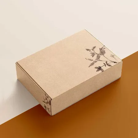
Stamp-style logos, hand-drawn lines and simple badges suit kraft particularly well. They look printed on purpose rather than squeezed onto a brown background.
Our step-by-step article on laying out mailer box artwork covers panels, bleed and logo placement.
- Use dark tones or white ink for small text
- Leave open brown space around the logo
- Ask for a white underlay behind photos
- Keep thin lines at a readable weight
- Check the proof on a brown background
A white inside for contrast
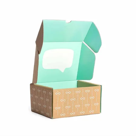
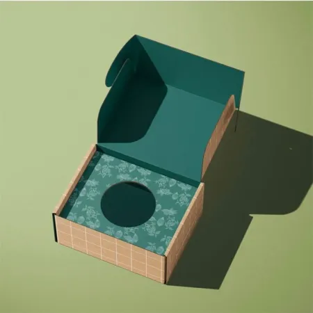
Some kraft corrugated is lined white on the inside. That gives you a brown outside and a clean white interior for bright printing.
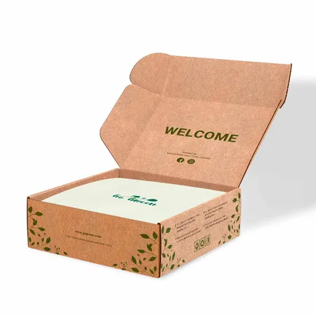
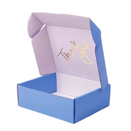
It is a strong combination. The outside looks natural and understated, and the lid opens on vivid color or a message.
Ask for this when you request a quote. It changes how we plan the inside print and the proof.
Kraft paperboard, by contrast, is usually brown on both sides. If you want a bright interior on a slim box, ask which paperboard options suit that.
Inside messages work well here. A short thank-you in your brand color on white feels like a handwritten note tucked inside.
Finishes that keep the natural feel
Many kraft boxes stay uncoated, which keeps the paper texture and look. An aqueous coating adds light protection without shine.
Gold, copper or black foil sits beautifully on brown board. Embossing a logo adds a subtle raised mark that suits handmade brands.
Gloss lamination is possible but changes the character of kraft. See our guide to printing and box finishes before deciding.
Soft-touch lamination on kraft gives a smooth, suede-like feel. It darkens the brown slightly, so check the proof notes if shade matters.
What kraft does and does not mean
Kraft describes the brown, unbleached paper on the outside. It is a look and a paper type, not a separate claim about the planet.
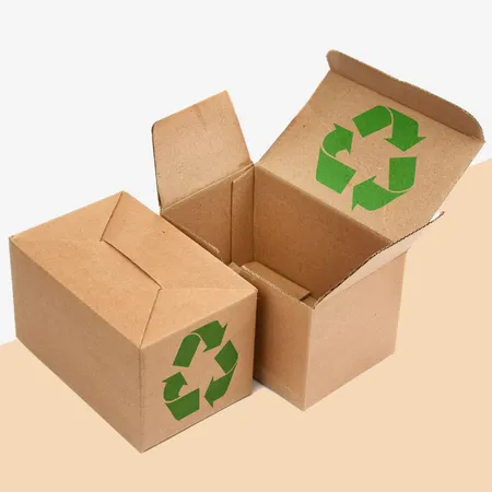
Corrugated and paperboard boxes are widely accepted in curbside paper recycling. Check local rules, since laminations and foils can change what is accepted.
If low-impact packaging is a core part of your brand, our page on eco-friendly mailer box options covers the choices in more depth.
Be careful with wording on the box itself. Only print environmental statements you can back up for your own supply chain.
Kraft mailer mistakes we see often
Approving a design checked only on a white screen is the most common one. Colors that look bright on screen turn muddy on brown.
Another is placing a pale logo straight on kraft without white ink. It nearly vanishes from a short distance.
The third is printing heavy full color over the whole box. It hides the kraft you chose in the first place, so white board may suit that design better.
Sellers also forget that kraft shows grease and water marks. Wrap oily soaps or food in paper or a bag before packing.
Last, many skip a test fold. Kraft corrugated creases differently from white board, so fold one sample and check the tuck before packing day.
Steps from logo to kraft box
Our team does the layout work at no charge, and revisions are unlimited. You can begin on the kraft box design page with a logo and a rough idea.
Share photos of your product next to some kraft paper if you have them. It helps us suggest ink colors that sit well with your goods.
- Measure your product and pick a board weight.
- Send logo files and note any brand Pantone colors.
- Decide if light colors need a white ink underlay.
- Check the digital proof on a brown preview.
- Approve, and production starts on our side.
Timing, cost and delivery
Kraft boxes print in 4 to 6 business days after your sign-off. Delivery takes 2 to 3 business days, free to the US, UK, Canada and Australia.
Kraft mailer unit prices start from $0.30. Size, board, ink coverage, white underlay, finish and quantity all affect the final quote.
Ask for a quote with and without a white underlay if you are unsure. The comparison often makes the decision easy.
Flat boxes store well on a dry shelf. Kraft can mark if it gets damp, so keep it off concrete floors.
If a carton arrives damaged or the print does not match the approved proof, you have 10 days to tell us. The return policy for misprints explains the next steps.
Kraft with matching outer cartons
Some brands pair a printed kraft mailer with a plain kraft outer for wholesale orders. Both share the same natural look.
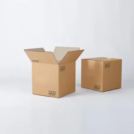
Our heavier kraft shipping cartons handle bulk transit while the mailer handles the unboxing.
For help choosing, call or WhatsApp (503) 461-4788 or write to info@shopmailerboxes.com.
Matching tape, tissue and stickers in brown, black or white finishes the look. Keep accents in one or two colors so the kraft stays the main texture.