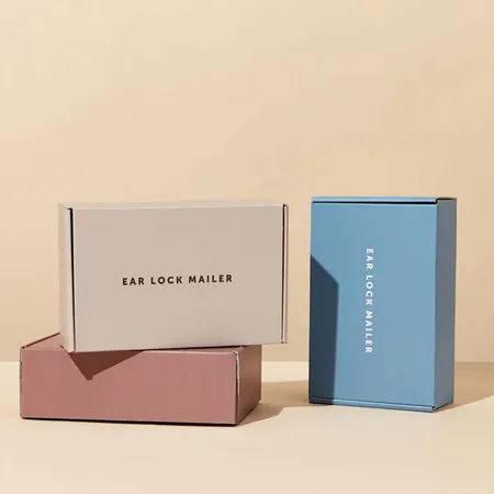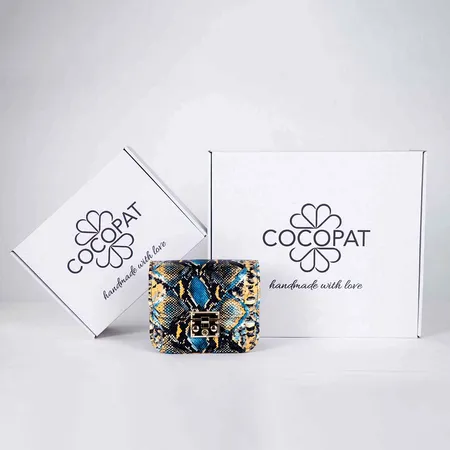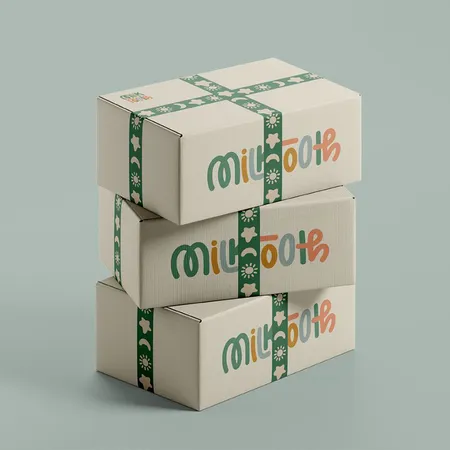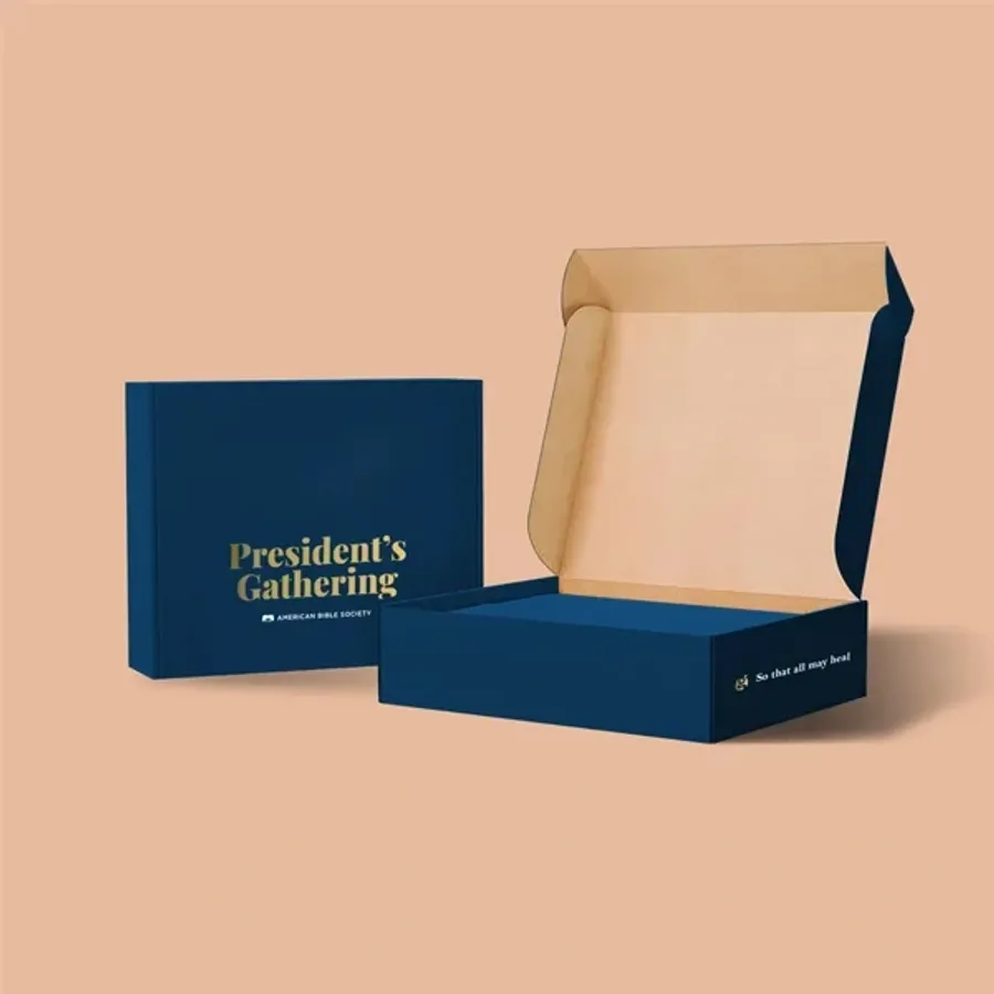
What turns a printed box into a branded one
Any box can carry a logo. A branded mailer goes further and follows the rules in your brand guide.
That means your exact color values, your typeface, your spacing around the logo and a tone of voice in any copy. When those rules hold, a customer knows the parcel is from you before reading the label.
Most of the work happens before printing. We check your files against your guide and flag anything that drifts. Then we show you the result on a flat proof of the real dieline.
This page suits brands that already have a settled identity. If your logo is still changing every few months, a simpler one-color print may serve you better until it settles.
Brand files to send with your quote request
The cleaner your files, the closer the first proof lands. Send what you already have and we fill the gaps.
A one-page brand sheet is often enough. If you have a full brand book, send it too. It tells us your logo clear space and any color pairs you avoid.
Our guide on laying out artwork on a mailer dieline covers bleed and safe zones if you are building files yourself.
- Logo as a vector file (AI, EPS, SVG or a PDF saved from them)
- Pantone codes for each brand color, or the HEX values if that is all you have
- Font names, or text already converted to outlines
- Any pattern, illustration or icon set you use on other packaging
- Short lines of copy for the inside lid or flaps
- Your website, social handle or QR code destination
- Photos of past packaging, labels or bags so we can see your brand in print
- A note on anything off limits, such as colors your brand never uses on dark backgrounds
Getting brand colors right on board
Screen colors and printed colors are not the same thing. A bright brand blue on a monitor can print dull in CMYK.
Pantone spot inks give the most reliable match for one or two key brand colors. Kraft board also shifts every color warmer, so we often add a white ink base under logos on kraft.
The table below shows the choices we suggest most often. Our page on printing methods and finish choices explains each option in more depth.
| Your brand color | Board | What we usually suggest |
|---|---|---|
| Strong single color | White liner | Pantone spot ink |
| Full photo or gradient | White liner | CMYK full color |
| Light pastel shade | Kraft liner | White ink base, then color |
| Black logo only | Kraft liner | One color, no white base |
| Metallic accent | Either | Foil stamping on the lid |
Placing your logo on each panel
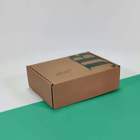
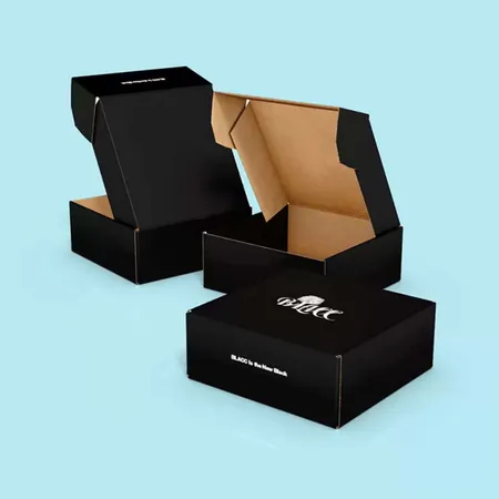
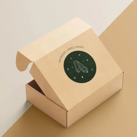
The lid is the panel people photograph, so it holds the main logo. Keep it centered or anchored to one corner, not floating at a random spot.
The front tuck panel is small and seen first when the box is upright. A short tagline or a small wordmark fits there better than a second large logo.
Side panels are useful for a website address or a repeating pattern. The base often stays plain, because it sits face down on a porch or a counter.
Remember where the shipping label will go. A courier label stuck over the lid logo hides your branding at the doorstep. We can leave a clear label zone on one side instead.
Branding the inside of the box
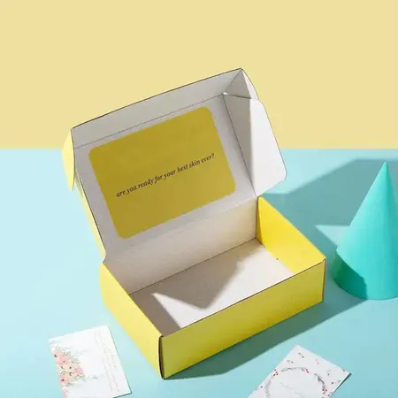
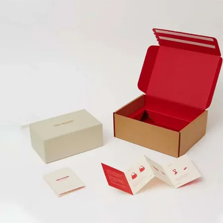
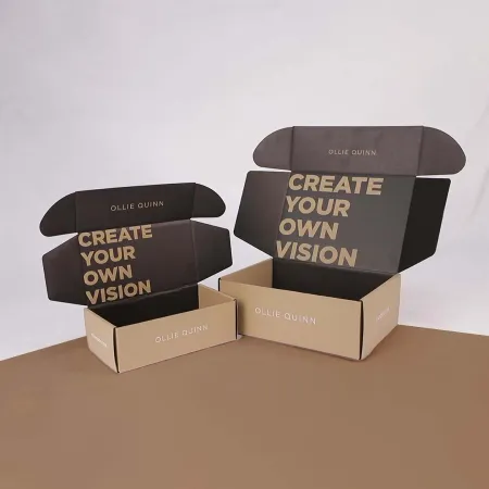
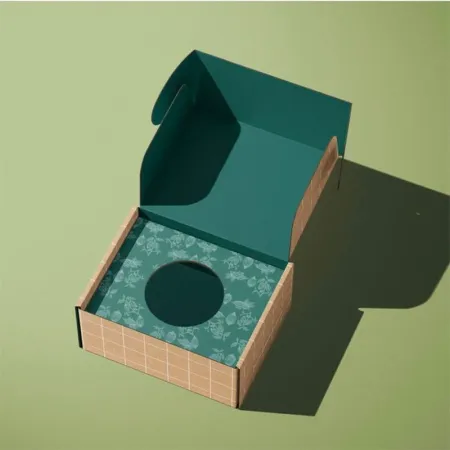
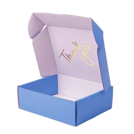
Inside printing is where branding turns personal. It is the one surface no courier, porch or sorting belt ever touches. Customers see it once the shipping label is gone and the lid lifts.
A short thank-you line, a care instruction or a social handle on the inside lid works well. Full-flood color inside costs more than a single line of text, so we quote both.
Write the inside copy in the same voice as your website. A formal brand should not suddenly sound jokey inside the lid. Our guide to planning the unboxing moment walks through the order in which customers see each surface.
From brand guide to printed box, step by step
The process is the same for a first order and a full brand refresh. Most of the back and forth happens at step four, and that is normal. You can also start by sketching ideas in our online box design page before you send files.
- Send your size, quantity, board choice and brand files.
- We reply with a quote and confirm the color plan.
- Our designers place your artwork on the dieline at no cost.
- You check the free digital proof and ask for any changes.
- Once you approve, production takes 4 to 6 business days.
- Boxes ship flat with 2 to 3 business days in transit, free to the US, UK, Canada and Australia.
Brand mistakes we catch before printing
These come up often on proofs, and each one is easy to fix before printing starts. We point them out in the proof notes so you can decide.
None of these mean your design is wrong. They are simply the details that only show up once flat artwork meets a folded box.
- Logo placed across a fold line, so it bends when the box closes
- Thin text near the tuck edge that gets lost in the cut
- Brand color sent as RGB only, which prints duller than expected
- Dark full-flood color on kraft without a white base
- Inside message printed upside down relative to how the lid opens
- Website address too small to read on a side panel
- Logo clear space ignored because the panel is narrower than expected
Reordering without your branding drifting
Brand consistency is easy to lose on a reorder. A new board batch or a changed file can shift a color slightly.
We keep your approved proof, Pantone references and board choice on file. When you reorder, we print from those records unless you tell us something changed.
If you update your logo between runs, tell us early so old and new boxes do not mix in your stock room. To start a repeat run, simply request a quote for your reorder and mention your previous order.