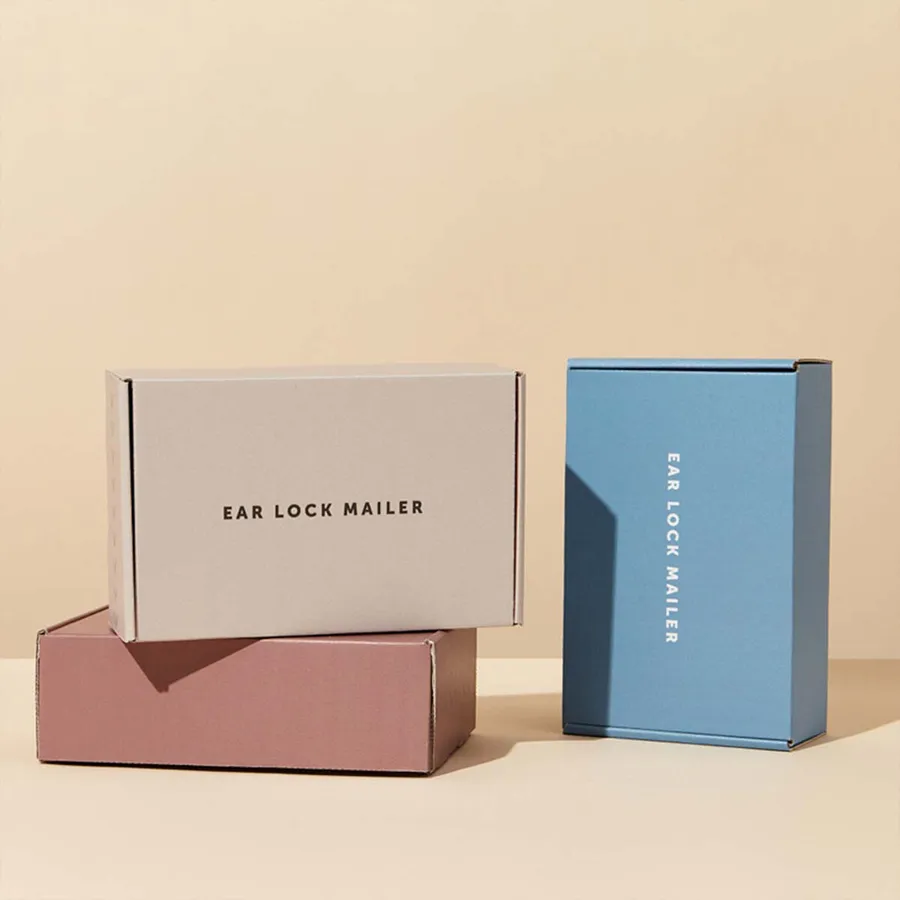
Brands that ship at a higher price point
Jewelry designers, watch sellers and fine fragrance brands order this box most. Their customers pay for the object and the ritual around it.
Fashion labels use it for silk scarves, leather wallets and limited drops. Corporate gifting teams use it for client thank-you gifts.
Premium skincare and wellness brands order it for launch editions. The outside has to justify the price before the product is even seen.
What these buyers share is scrutiny. Their customers notice a crooked foil line or a scuffed corner, and they post photos of both.
Boutique hotels and members clubs also order it for welcome gifts. A guest who receives one tends to keep the box on a shelf.
Rigid chipboard or premium corrugated
The first decision is the build. It sets the weight in the hand, the cost and how the box behaves in the mail.
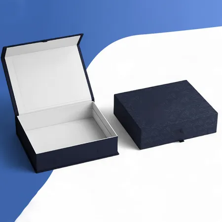
A rigid mailer is thick chipboard wrapped in printed paper. It feels solid, keeps its shape for years and is often kept as a keepsake.
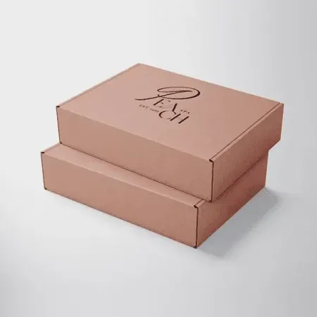
A premium corrugated mailer is lighter and folds flat for storage. With soft-touch and foil it still reads as high-end, and it ships with less postage.
Many brands use rigid for their top line and corrugated for everyday premium orders. You can see the full build range in our rigid chipboard packaging mailers range.
| Factor | Rigid chipboard | Premium corrugated |
|---|---|---|
| Feel in the hand | Heavy and solid | Light but firm |
| Storage before packing | Takes more shelf space | Ships and stores flat |
| Edge and corner look | Crisp wrapped corners | Clean folded corners |
| Postage weight | Higher | Lower |
| Best for | Keepsake gifts, top-tier lines | Regular premium orders |
Picking finishes that work together
Luxury rarely means using every finish at once. Two or three well-placed effects look richer than five competing ones.
Soft-touch lamination is the usual base. It gives a velvet feel and mutes color slightly, which suits dark and muted palettes.
Foil stamping adds metal shine to a logo or a thin border. Embossing raises the logo so a customer feels it with a thumb.
Spot UV places a gloss layer on one area over a matte base. Our guide to box printing and finishes shows how each effect is applied.
Pantone matching is worth asking for on luxury work. A house color that drifts between print runs is noticed by loyal customers.
- Soft-touch base with gold foil logo: classic and quiet.
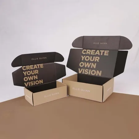
- Matte black with spot UV pattern: bold but still subtle.
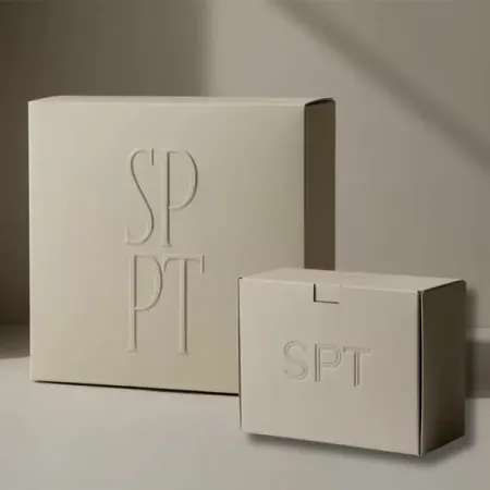
- White with blind emboss and no ink: minimal and gallery-like.
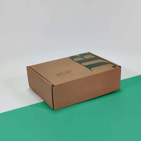
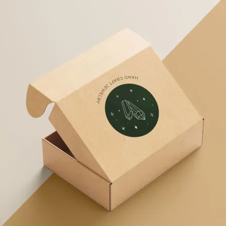
- Kraft with white ink and copper foil: natural but premium.
- Deep color with debossed logo and foil inside the lid: a hidden detail.
Order the decisions the right way round
Choosing finishes before the build often leads to rework. This order saves proof rounds and keeps the brief clear for our designers.
- Measure the product with any pouch, tissue or dust bag it ships in.
- Choose rigid or corrugated based on how the box is used and kept.
- Pick the base color and lamination for the whole box.
- Choose one hero finish for the logo, such as foil or emboss.
- Decide what is printed inside the lid and on the inner base.
- Add an insert if the product must sit in one exact spot.
- Mark up the proof with notes on foil and emboss, then approve it.
The inside matters as much as the lid
A plain brown interior can undo a beautiful outside. When the lid lifts, the customer sees the inside first.
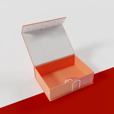
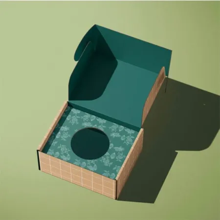
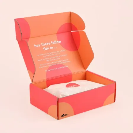
Full-color inside printing lets you flood the interior with your brand color. It can also carry a short message or a pattern.
A fitted insert holds the piece in place like a display case. For jewelry, a slot or a raised platform keeps it centered.
Our unboxing experience planning guide covers the order in which a customer sees each layer.
Tissue, a ribbon pull or a sealed sticker add one more step before the reveal. Each layer slows the moment down, which is the point.
Keep inserts in the same color family as the inside print. A bright white insert in a black box can look like an afterthought.
Protecting delicate finishes in the post
Soft-touch and dark colors show scuffs from sorting belts. A rigid mailer wrapped in printed paper can also mark at the corners.
Many luxury brands place the printed mailer inside a plain outer carton for the trip. The customer then opens a clean box at home.
If you skip the outer carton, choose a slightly tougher finish. Matte lamination hides light scuffs better than soft-touch does.
Foil on a sharp edge can crack where the board folds. We keep foil a few millimeters back from fold lines on the proof.
A snug fit also protects the finish. When the box is filled edge to edge, the walls flex less and the corners crease less.
Mistakes that make a premium box look cheap
Most of these come from artwork, not from the print run. They are easy to catch at the proof stage if you know to look.
Thin script fonts can fill in when foiled or embossed. Our walkthrough on how to design a mailer box covers line weights, so ask for a heavier logo if yours has hairlines.
Rich black built only from black ink looks gray on large panels. Our team sets a deeper black on your file before proofing.
Too many colors on a soft-touch surface look busy. One or two brand colors, plus foil, usually read as more expensive.
Barcodes and return labels are another trap. Place them on the outer carton or on a small sticker, never printed across the lid art.
Luxury mailers for gifting seasons
Corporate gifts and holiday drops are a large share of luxury orders. Timing matters more here than with any other box.
Count back from your send date: proof time, 4–6 business days of production, then 2–3 business days in transit.
Some brands keep one luxury design all year and add a seasonal sleeve or sticker. Others print a full limited design, like our custom holiday mailer box designs for gift season.
Either route works. The seasonal sleeve keeps your core boxes usable once the season ends.
Kraft and white liners in a premium build
Luxury does not have to mean black and gold. A kraft liner with white ink and a single foil can feel crafted and expensive.
White liners give the cleanest base for bright brand colors and photography. They also make soft pastels look true.
If your brand leans natural, combine kraft with debossing and no lamination. The texture of the board becomes part of the design.
Kraft also hides small scuffs far better than a dark laminated panel. That makes it a practical choice for brands that skip the outer carton.
Quote, proof and production
Send your product size, your logo and the finishes you are considering. Our team returns a free proof with each effect marked on the panels.
Revisions are unlimited, so take time to get foil size and placement exactly right. Nothing prints until you approve.
Prices start from $0.30 per unit, and every finish you add is priced on your quote. Start the process with our luxury box quote request.
Delivery to the US, UK, Canada and Australia costs you nothing, and parcels spend 2–3 business days on the road.
Talking through a luxury box brief
Some briefs are easier to explain out loud. Call or WhatsApp (503) 461-4788, or email info@shopmailerboxes.com with photos of the product.
If a finished box arrives misprinted or damaged, report it within 10 days. Our reprint and refund terms explain what happens next.
For gifting projects with many recipients, mention the send date and rough count in your first email. That lets us plan proof rounds around your deadline.