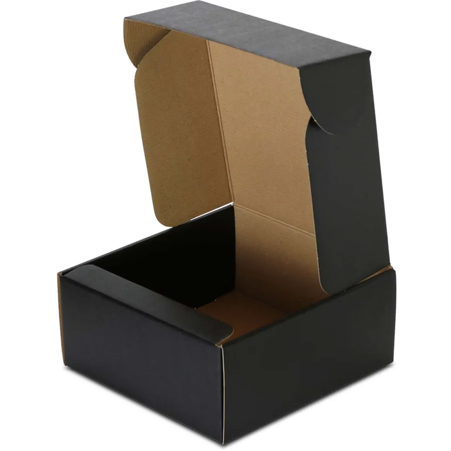
Brands that pick a black mailer
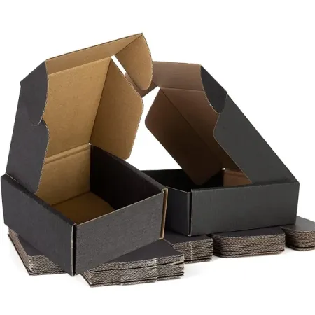
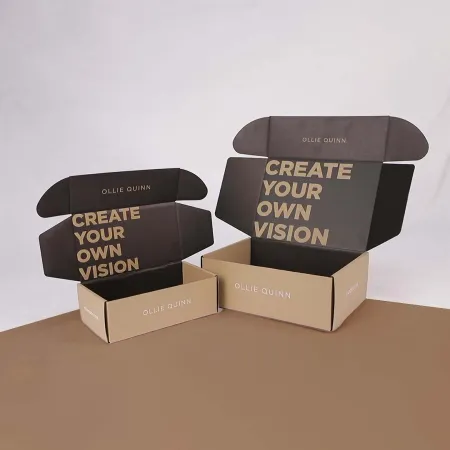
Black boxes suit products that want to feel premium the moment the parcel lands. Streetwear labels, watch and jewelry sellers, tech accessory shops and men's grooming lines order them most.
The color frames whatever sits inside. A bright product or colorful tissue paper looks sharper against a dark interior or lid.
Black also hides the small marks a box picks up between your packing table and the customer's door. That makes it a practical choice as well as a stylish one.
These are printed tuck front mailers made for unboxing. If you need a plain outer carton for heavy transit, our heavy-duty black shipping boxes are built for that job instead.
How we print a deep, even black
Plain black ink on its own can look slightly gray on board. We add cyan, magenta and yellow under the black to build a richer tone.
For exact brand matching, a Pantone black is another route. It gives very consistent color from one reorder to the next.
Large flat black areas show every small variation. A matte or soft-touch lamination evens out the surface so the black looks smooth under shop lights.
We check the black on your proof against your brand guide before printing. If something looks off on screen, tell us and we will adjust the build.
Finishes that work on black
Black gives accents more contrast than any other base color. The table compares the finishes buyers ask about most.
Our full guide to box printing and finishes shows close-up photos of each effect.
Pick one main accent rather than stacking every effect. A single gold foil logo on matte black usually looks more refined than foil, spot UV and embossing together.
| Finish | Look on black | What to watch |
|---|---|---|
| Gold foil | Warm, high contrast logo | Fine lines under 0.5 mm can fill in |
| Silver foil | Cool, modern shine | Shows fingerprints on gloss areas |
| Spot UV on matte | Tone-on-tone gloss pattern | Subtle in low light |
| Soft-touch lamination | Velvet feel, very deep black | Marks if dragged across rough surfaces |
| Debossing | Pressed logo with shadow | Needs simple shapes to read well |
Liner choice and cracking at the folds
When black ink folds over a crease, the board underneath can show through as a thin line. On a white liner, that line looks bright and obvious.
Lamination helps hold the ink layer together at each fold. Our team also adjusts the crease rules on the dieline to reduce cracking.
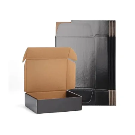
Kraft liner under black ink gives a brown line instead of a white one. Some brands prefer that softer look, so ask for a kraft sample if it matters to you.
Thicker boards crack more easily than thin ones. That is one more reason to choose the lightest board that still protects your product.
Setting up black artwork
Most black box problems start in the artwork file. Following these steps saves a round of proof changes.
If you only have a JPG logo, send it anyway. Our designers can redraw simple marks as vectors before your proof is made.
- Set large black areas as rich black, not 100% K only.
- Keep small text in plain black so the letters stay sharp.
- Use white or foil for text on the black panels.
- Extend black backgrounds 1/8 inch past the trim line.
- Put foil and spot UV on separate layers named clearly.
- Send vector logos so foil edges come out crisp.
Making the inside work as hard as the outside
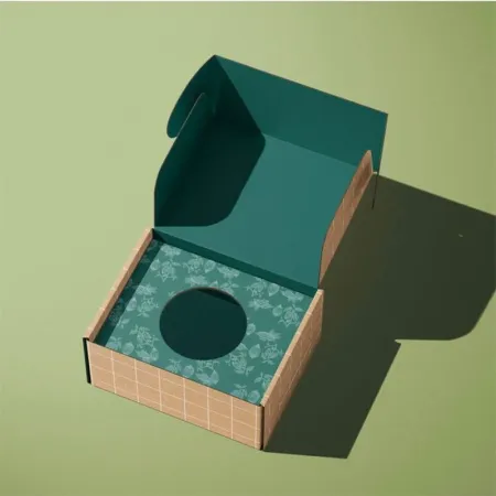
A black outside and a bright inside is a strong combination. Customers see the dark lid, then a pop of brand color as it opens.
Inside printing can carry a pattern, a thank-you line or a care guide. Some brands keep the inside plain black and rely on colored tissue instead.
Keep inside text short. Customers glance at it for a second while they lift the product, so one line usually works better than a paragraph.
See how two-sided layouts look on our page for double sided printed mailer boxes before you decide.
Corrugated or paperboard under black print
Paperboard at 18–24 pt takes the smoothest black and sharpest foil. It suits light items such as wallets, scarves and phone cases.
E-flute corrugated adds strength for heavier goods and direct mailing. The surface is slightly less flat, but lamination hides most of the difference.
For heavier items, ask about B-flute. It adds protection, though fine foil detail is harder to hold on the thicker board.
Tell us what the product weighs and how you send it. We will suggest a board and confirm it on the quote before you commit.
Care, scuffs and storage
Dark boxes show scuffs and dust more than light ones. Store your flat stock in its carton until packing day so the surfaces stay clean.
Pack on a clean table and avoid sliding boxes across each other. A soft-touch surface marks if it rubs against rough cardboard.
Wipe away dust with a dry, soft cloth before packing. Avoid wet wipes on soft-touch, since moisture can leave a mark on the coating.
If scuffing worries you, gloss lamination is the toughest option. Compare it with lighter colors on our mailer box colors and finishes page.
Planning the unboxing moment
A black box builds a little suspense. Use that by placing the hero product in the center with nothing covering its face.
A printed card with the customer's next step, such as a care tip or a reorder code, sits well on top of the tissue.
Consider how the box looks in a photo too. Black boxes photograph well against light backgrounds, which helps when customers share their orders.
Our guide to planning a better unboxing walks through layout, fill and inserts in more detail.
Proofs, timing and delivery
Every order gets a free digital proof, and you can revise it as many times as you need. Ask for help from our designers if your files are not print-ready.
Once you approve the black and foil layers, printing takes 4–6 business days. Boxes then ship free to the US, UK, Canada or Australia and land within 2–3 business days.
Order a little extra stock for launches. Black boxes are often used for limited drops, and running short in the middle of one is stressful.
Want to sketch your layout first? Try our online box design page and send us the result.