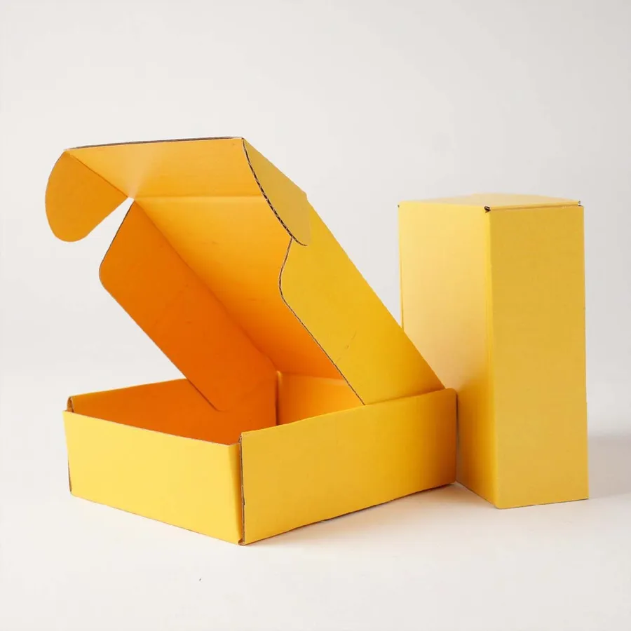
Who asks us for yellow boxes
Yellow suits brands built around warmth and good mood. Bakeries, honey producers, lemonade and citrus brands ask for it often.
Kids' clothing shops and stationery makers like its playful feel. Sunscreen and summer accessory sellers use it for seasonal launches.
Some brands simply own yellow already. If your logo is yellow, a full yellow box makes the brand recognizable before the label is read.
Snack and candy brands pick yellow for its appetite appeal. It sits naturally next to photos of baked goods, fruit and sweets.
Yellow also stands out on porches full of brown cartons. A buyer spots it from the street before reaching the door.
Picking your shade of yellow
Yellow covers a wide range, from pale butter to bright lemon to deep mustard. Each one sends a different message.
Pale yellows feel soft and calm. Bright lemon feels fresh and energetic, while golden and mustard tones feel warm and grown up.
The table shows how these families behave in print. Send a Pantone number, and we will tell you how close each route gets.
Look at your shade on paper, not only on screen. Screens show yellow brighter and greener than ink usually prints.
| Shade family | Feel | Print notes |
|---|---|---|
| Butter or pale yellow | Soft and gentle | Prints well in CMYK on white liner |
| Lemon yellow | Fresh and bright | Pantone keeps it vivid and even |
| Golden yellow | Warm and inviting | Small shifts in red ink change it, so Pantone helps |
| Mustard | Earthy and mature | Can be built on white or printed on kraft |
Why yellow needs a white base
Yellow ink is very transparent. Whatever is underneath shows through and changes the color.
On white-lined board, yellow looks clean and bright. On brown kraft, the same ink turns olive or dull mustard.
That is why nearly all our yellow mailers use white-lined corrugated or SBS paperboard. Kraft only works when an earthy mustard is the goal.
SBS paperboard gives the cleanest yellow of all, since its surface is smooth and very bright. It suits small, light items like cards or accessories.
If you want yellow on kraft, a white ink layer under the yellow helps. It adds a print pass, so ask about it in your quote. Our printed kraft mailer boxes show how ink behaves on brown board.
Logo and text colors that read on yellow
Yellow is light, so contrast decides how readable your logo is. Black, navy and deep brown all read clearly against it.
White text on yellow is the most common mistake we see. It almost disappears on a pale or lemon background.
Red and orange can work on golden yellow, but test them on the proof. They sit close to yellow on the color wheel and can blur together.
Thin script fonts lose detail on yellow faster than bold ones. Give fine lettering a heavier weight or a dark outline.
If you need help balancing the colors, our mailer box design guide covers contrast and placement.
- Black: the strongest contrast, crisp and modern.
- Navy or deep blue: high contrast with a softer feel.
- Dark brown: warm and natural, suits bakeries and honey brands.
- White: avoid on pale yellows, it barely shows.
- Red or orange: test first on golden shades.
Keeping yellow consistent on every run
Yellow shows small ink changes more than darker colors. A run that leans slightly green or orange is easy to notice next to the last batch.
A Pantone spot yellow solves most of this. It is mixed to a fixed formula, so each reorder matches the previous one closely.
CMYK yellow can still look great for one-off runs or full illustrated designs. It is less predictable when you need two runs to sit side by side.
Keep a box from your first run as your color reference. Send a photo or the box itself when you reorder.
Mixed shades like golden yellow need extra care. A small change in the red component turns them toward orange quickly.
Coatings and finishes on a yellow box
Gloss lamination makes yellow look juicier and more saturated. It suits bright lemon and golden tones.
Matte lamination softens yellow and gives it a calmer, modern feel. Pale and mustard shades look especially good matte.
Soft-touch adds a velvety feel but can shift yellow slightly darker. We show that effect on the proof notes.
Gold foil looks rich on mustard but can get lost on bright yellow. Black foil or a dark spot UV logo stands out better. See all the options in our printing and finish options guide.
Yellow outside, something else inside
Many brands pair a yellow outside with a white interior. It feels bright and clean when the lid opens.
Others flip the idea and print a bold contrast inside, such as black or navy. That turns opening the box into a small moment of surprise.
Inside the lid is a good place for a thank-you note, recipe card text or a short brand story. Short lines in a dark ink read best against a sunny panel.
A yellow insert inside a white box is another option. It brings the color to the opening without coloring the whole exterior.
To compare yellow with neighboring colors before you commit, view our range of colored mailer boxes.
Ordering yellow mailers, step by step
These steps help yellow orders come out right the first time.
Step three catches the most problems. A logo that looked fine on white artwork can fade away once the background turns yellow.
- Find your yellow's Pantone number, or send a physical sample.
- Choose white-lined corrugated or SBS for a clean yellow.
- Pick a dark logo color that contrasts with your shade.
- Decide on gloss, matte or soft-touch lamination.
- Place the artwork on the dieline, inside and out.
- Review the free digital proof and the color notes.
- Approve to start production.
Storing yellow boxes away from sunlight
Bright yellows can fade if flat boxes sit in direct sun for weeks. A stack near a window may come out paler on top than below.
Store flat boxes in their cartons, in a shaded and dry part of the room. Lamination slows fading, but darkness is the best protection.
Pale yellows also show dust and fingerprints sooner than mustard. Keep packing tables clean and handle the lid by its edges where you can.
Once packed, a yellow box spends only a few days in transit. Short trips like that rarely cause visible fading.
Seasonal runs and limited editions
Yellow is a natural fit for spring and summer launches. Easter gifts, summer menus and back-to-school kits often use it for a single season.
A short seasonal run lets you test yellow without changing your core packaging. If it performs well, you can keep it.
Plan seasonal runs a few weeks ahead. That leaves time for proof revisions and 4–6 business days of production.
For other cheerful seasonal colors, our custom orange mailer boxes suit autumn launches in the same way.
Keep the same dieline for your seasonal yellow and your regular box. Only the artwork then changes between runs.
Proofs, production and getting boxes to you
Your design help and digital proof are free, and you can revise until the yellow looks right. Printing waits for your sign-off.
Allow 4–6 business days on press. Boxes then ship free to the US, UK, Canada and Australia, arriving in 2–3 business days.
Misprinted or damaged yellow boxes are reprinted or refunded if you flag them within 10 days. Compare one box against your color reference on arrival.
Ready to start? Get a quote for yellow mailers and tell us your shade.