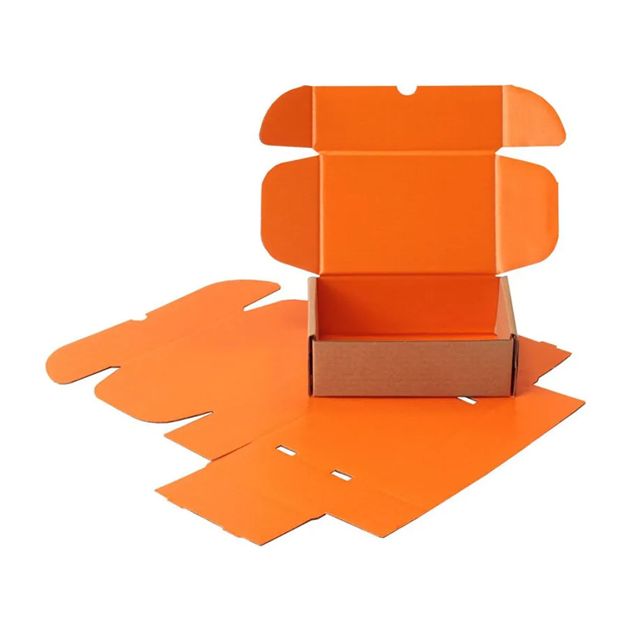
Who orders an orange mailer
Orange tends to suit brands with energy in their story. Snack makers, kids' toy shops, fitness gear sellers and pet brands ask for it most.
It also works for sellers who want their parcel spotted fast in a pile of brown cartons. A customer sees the color on the porch and knows the order has arrived.
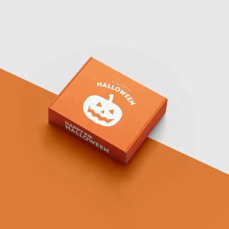
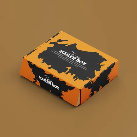
Some buyers only need orange for one season. Autumn launches, harvest promotions and October gift boxes are common short runs. Our printed Halloween mailer boxes cover the spooky side of that season.
If orange is already in your logo, a full orange box makes the brand feel bigger than a single printed mark would.
Orange also signals value and fun without feeling cheap when the print is clean. That balance is why premium snack brands still choose it.
Picking a shade of orange that prints true
Orange is one of the hardest colors to hit with standard four-color ink. Screens show a brighter orange than CMYK can reach on board.
A Pantone spot ink solves most of that. It is mixed to a set formula, so the color matches your brand guide and stays the same on reorders.
The table shows how common orange families behave on a mailer. Send us your Pantone number or a physical sample, and we will tell you which route fits.
If you have no Pantone reference, a CMYK orange can still look good. We simply avoid promising a match to a bright screen tone that ink cannot reach.
Mixed oranges also shift between board types. A shade approved on paperboard may print a touch darker on corrugated, so tell us if you use both.
| Orange family | Best print route | What to expect |
|---|---|---|
| Bright tangerine | Pantone spot ink | Closest to the screen color |
| Burnt or rust orange | CMYK or Pantone | Prints well on white or kraft |
| Peach and apricot | CMYK with light coverage | Can drift pale without a proof check |
| Neon orange | Fluorescent Pantone | Ask us first, coverage is limited |
| Terracotta | CMYK on kraft liner | Earthy tone, slightly muted |
White liner or kraft under the ink
The board under the ink changes the orange more than any other choice. White liner reflects light back through the color and keeps it bright.
Kraft liner is brown, so orange printed on it turns deeper and warmer. That can look great for a rustic or handmade brand, but it will not match a bright logo.
A layer of white ink under the orange on kraft brings back some brightness. It adds a print step, so ask about it in your quote.
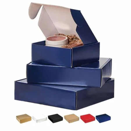
For a direct comparison of liners and colors, our range of mailer box colors and finishes shows real examples side by side.
How the box is built
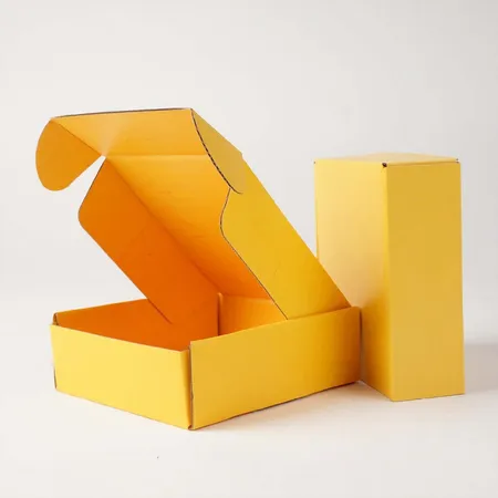
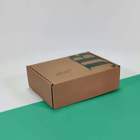
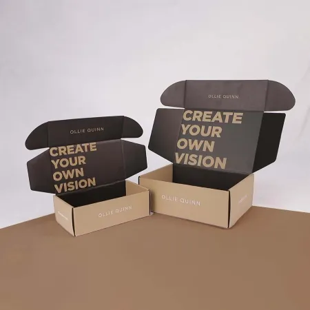
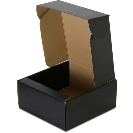
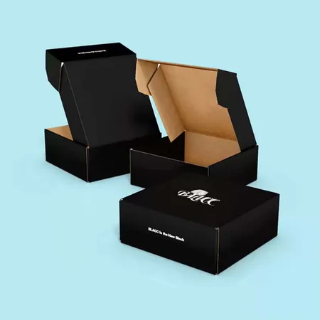
Most orange mailers we print are roll end tuck front boxes. The front panel tucks in to lock the lid, and the double side walls keep the box square.
E-flute corrugated at 1.5 mm is the usual pick for clothing, cosmetics and small gifts. B-flute at 3 mm suits heavier items like tools or boxed snacks.
Light items such as socks or cards can go in 18–24 pt SBS paperboard. It gives the smoothest print surface for flat color areas.
Flat orange on corrugated can show faint lines from the flutes underneath. E-flute keeps those lines finer than B-flute, which matters on large solid panels.
Measure your product, then add room for tissue or an insert. Our mailer box sizes guide explains inside versus outside dimensions so the box is not too tight.
An ear lock or tuck top style is also available if your packing line prefers it. Each style folds flat for storage and ships to you unassembled.
Coatings and accents on orange
Gloss lamination makes orange look juicy and saturated. It also shows fingerprints more, so it suits boxes handled once rather than displayed.
Matte lamination softens the color into a calmer, modern tone. Soft-touch adds a velvet feel that pairs well with a deep burnt orange.
Accents look strong against orange. Black or white text reads clearly, and gold foil adds warmth. Read our guide to box printing and finishes before you stack effects.
We suggest one main accent per box. A foil logo on matte orange usually beats foil plus spot UV plus embossing together.
Steps to set up orange artwork
A few file habits keep the orange solid and the edges clean. Follow these before you send artwork.
Starting from a blank page? Our walkthrough on how to design a mailer box covers panels, folds and safe zones. Our team also builds artwork from your logo at no charge.
- Name your orange as a Pantone swatch if you have one.
- Keep large orange areas as one flat color, not a gradient.
- Extend the orange background 1/8 inch past every trim line.
- Use black or white for small text on orange panels.
- Put foil or spot UV on its own clearly named layer.
- Send vector logos so edges stay sharp at the folds.
Fading, scuffs and storage
Bright orange inks can lose some strength under long, direct sunlight. Store flat boxes away from windows and they will keep their color.
Scuffs show as pale lines on a dark orange. A lamination layer protects the ink better than an uncoated surface.
Keep flat boxes in their cartons until packing day. Corners bent in storage are the first place a customer notices wear.
Light oranges like peach show dirt and grease more than dark ones. If boxes pass through a busy warehouse, a deeper shade or a gloss coat hides handling marks.
Shipping labels on orange should sit on a clear panel. Leave a plain white or light area on the lid so scanners read the barcode easily.
Where orange boxes earn their keep
These are the uses where orange tends to make the strongest first impression on a doorstep.
Pick the closest one to your product, and we will suggest a board and coating that suit it.
- Snack and treat subscription parcels.
- Kids' toys, craft kits and party favors.
- Fitness supplements and gym accessories.
- Pet toys and treat bundles.
- Autumn and harvest season promotions.
Making the inside match the outside
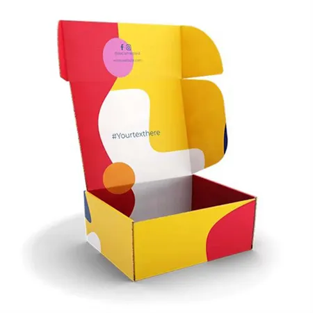
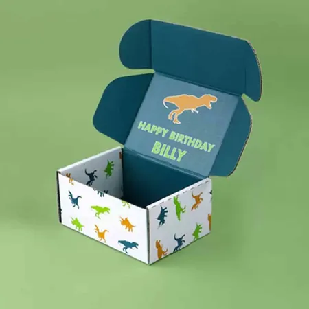
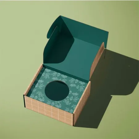
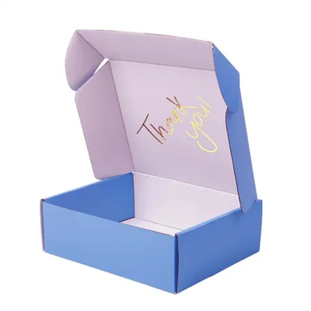
An orange outside with a plain inside can feel unfinished. A simple inside print, such as a pattern or a thank you line, finishes the opening.
Some brands flip the scheme and print orange only inside. The outside stays white or kraft, and the color is the surprise. Our unboxing experience guide has ideas for the first view of the lid.
Inside print adds a pass through the press, so it is quoted separately. Your proof will show both sides flat so you can check alignment.
Orange tissue or a printed orange card can also bring color inside without a second print pass. It is a cheaper way to test the look first.
Proof, production and shipping
Your free digital proof labels every orange area with its Pantone number or CMYK values. Ask for as many revisions as the shade needs.
Once the orange is signed off, the press run takes 4–6 business days. Your flat boxes then spend 2–3 business days with the carrier, with no freight fee to the US, UK, Canada or Australia.
Spot a misprinted orange panel or a crushed carton? Tell us within 10 days and we reprint or refund those boxes. When the shade is settled, request a quote for orange mailers with your size and quantity.